In the previous session we looked at identifying and measuring patterns of spatial autocorrelation (clustering) in data. If those patterns exist then there is potential to use them to our advantage by ‘pooling’ the data for geographical sub-spaces of the map, creating local summary statistics for those various parts of the map, and then comparing those statistics to look for spatial variation (spatial heterogeneity) across the map and in the data. The method we shall use here is found in GWmodel – an R Package for Exploring Spatial Heterogeneity Using Geographically Weighted Models. These are geographically weighted statistics.
Broadly, there are three parts to this session, which are:
Introducing Geographically Weighted Statistics and how they work
Giving some applications of Geographically Weighted Statistics
Thinking a bit more about mapping data and the problem of ‘invisibility’ (small areas) in some maps.
The first two of these are directly related to Geographically Weighted Statistics. The third is more generally related to presenting and communicating results.
Geographical Weighted Statistics
The idea behind geographically weighted statistics is simple. For example, instead of calculating the (global) mean average for all of the data, and therefore for the whole map, a series of (local) averages are calculated for various sub-spaces within the map. Those location specific averages can then be compared.
It works likes this. Imagine a point location, \(i\), at position \((u_i, v_i)\) on the map. To calculate the local statistic:
First find either the \(k\) nearest neighbours to \(i\) or all of those within a fixed distance, \(d\), from it. In this way, we are defining \(i\)’s neighbours.
Second, to add the geographical weighting, apply a weighting scheme whereby the neighbours nearest to \(i\) have most weight in the subsequent calculations, and the weights decrease with increasing distance from \(i\), becoming zero at the \(k\)th nearest neighbour or at the distance threshold, \(d\). Here we are defining spatial weights.
Third, calculate, for the point and its neighbours, the weighted mean value (or some other summary statistic) of a variable, using the inverse distance weighting (the spatial weights) in the calculation.
Fourth, repeat the process for other points on the map. This means that if there are \(n\) points of calculation then there will be \(n\) geographically weighted mean values calculated across the map that can be compared to look for spatial variation. Often those \(n\) points will be the centroids of the regions or neighbourhoods (or whatever) that are being studied. But, they do not have to be.
Let’s see this in action, beginning by ensuring the necessary packages are installed and required. As with previous sessions, you might start by opening the R Project that you created for these classes.
sp and its associated packages have been retired in favour of sf and others. The reason for requiring it here is that the GWmodel package that we will use for the geographically weighted statistics still uses it.
We will use the same data as in the previous session but confine the analysis to the Western Cape of South Africa. This is largely to reduce run times but there is another reason that I shall return to presently.
The calculation points for the geographically weighted statistics will be the ward centroids. A slight complication here is that GWmodel presently is built around the elder sp not sf formats for handling spatial data in R so the wards need to be converted from the one format to the other.
Code
wcape_wards_sp <-as_Spatial(wcape_wards)
We can see that wcape_wards is of class sf,
Code
class(wcape_wards)
[1] "sf" "data.frame"
whereas wcape_wards_sp is now of class SpatialPolygonsDataFrame, which is what we want.
Having made the conversion we are ready to calculate some geographically weighted statistics, doing so for the High_income variable – the percentage of the population with income R614401 or greater in 2011 – in the example below.
As well as the local means (LM), the local standard deviations (LSD), variances (LVar), skews (LSke) and coefficients of variation (LCV) are included (the coefficient of variation is the ratio of the standard deviation to the mean). The local medians (Median), interquartile ranges (IQR) and quantile imbalances (QI) can also be added by including the argument quantile = TRUE in gwss():
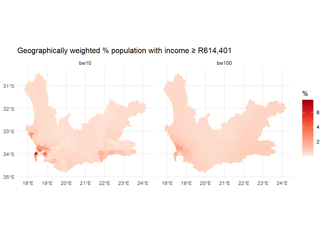
… but it (usually) matters less than the bandwidth, which controls the amount of spatial smoothing: the larger it is, the more neighbours are being averaged over. The trade-off is between bias and precision. A smaller bandwidth is less likely to average-out geographical detail in the data and should create geographically weighted statistics that are representative of the location at the centre of the kernel but are also dependent on a small number of observations, some or more of which could be in error or be unusual for that part of the map.
The following maps compare a bandwidth of \(bw = 10\) nearest neighbours to \(bw = 100\). If you zoom into the areas around the north of Cape Town you will see some of the differences. Note that the argument adaptive = TRUE sets the bandwidth to be in terms of nearest neighbours, else it would indicate a fixed distance of 10 metres. The advantage of using nearest neighbours is it allows for varying population densities. Otherwise, when using a fixed distance, more rural areas will tend to have fewer neighbours than urban ones because those rural areas are larger and more spaced apart.
Code
gwstats <-gwss(wcape_wards_sp , vars ="High_income", bw =10,kernel ="bisquare",adaptive =TRUE, longlat = T)wcape_wards$bw10 <- gwstats$SDF$High_income_LMgwstats <-gwss(wcape_wards_sp , vars ="High_income", bw =100,kernel ="bisquare",adaptive =TRUE, longlat = T)wcape_wards$bw100 <- gwstats$SDF$High_income_LMwards2 <-pivot_longer(wcape_wards, cols =starts_with("bw"), names_to ="bw",values_to ="GWmean")tmap_mode("view")tm_basemap("OpenStreetMap") +tm_shape(wards2, name ="wards") +tm_polygons(fill ="GWmean",fill.scale =tm_scale_intervals(values ="brewer.reds", n =5, style ="equal" ),fill_alpha =0.7,fill.legend =tm_legend(title ="%",format =list(digits =1, suffix ="%") ),id ="District_1",popup.vars =c("GW mean:"="GWmean", "Ward ID:"="WardID"),popup.format =tm_label_format(digits =1) ) +tm_borders() +tm_facets(by ="bw") +tm_title("Geographically weighted % population with income R614,401 or greater")
A nice feature of the facetting (tm_facets) in tmap is it has created two dynamically linked maps.
Here is a version of the maps using ggplot().
Code
library(ggplot2)ggplot(wards2) +geom_sf(aes(fill = GWmean), colour =NA) +scale_fill_distiller(type ="seq",palette ="Reds",direction =1,name ="%" ) +facet_wrap(~ bw) +theme_minimal(base_size =10) +labs(title ="Geographically weighted % population with income ≥ R614,401", )
### A slight tangent
You may note the use of the pivot_longer function from the tidyverse packages in the code above. To see what this does, take a look at,
What you can see is that the two columns, bw10 and bw100 from the first table have been stacked into rows in the second. This takes the table from a wide format to a long one, hence the function name pivot_longer(). Doing this allows us to create the two linked plots by faceting on the bandwidth variable, bw, using tm_facets(by = "bw"). The reverse operation to pivot_longer() is pivot_wider() – see ?pivot_wider.
‘Pre-calculating’ the distance matrix
In the calculations above, the distances between the ward centroids that are used in the geographical weighting were calculated twice. First in gwss(wcape_wards_sp, vars = "High_income", bw = 10, ...) and then again in gwss(wcape_wards_sp, vars = "High_income", bw = 100, ...). Since those distances don’t actually change – the centroids are fixed so therefore are the distances between them – so we might have saved a little computational time by calculating the distance matrix in advance and then using it in the geographically weighted statistics. Curiously, though, it actually takes longer. I assume this is because the data set isn’t large enough to justify the extra step of saving the distances in a matrix and then passing that matrix to the gwss() function.
Code
# Time to do the calculations without pre-calculating the distance matrixsystem.time({ gwstats <-gwss(wcape_wards_sp , vars ="High_income", bw =10,kernel ="bisquare",adaptive =TRUE, longlat = T) wcape_wards$bw10 <- gwstats$SDF$High_income_LM gwstats <-gwss(wcape_wards_sp , vars ="High_income", bw =100,kernel ="bisquare",adaptive =TRUE, longlat = T) wcape_wards$bw100 <- gwstats$SDF$High_income_LM})
   user  system elapsed
   0.22    0.00    0.24
Code
# Time to do the calculations with the pre-calculated distance matrixsystem.time({ coords <-st_coordinates(st_centroid(wcape_wards)) dmatrix <-gw.dist(coords, longlat = T) gwstats <-gwss(wcape_wards_sp , vars ="High_income", bw =10,kernel ="bisquare",adaptive =TRUE, longlat = T, dMat = dmatrix) wcape_wards$bw10 <- gwstats$SDF$High_income_LM gwstats <-gwss(wcape_wards_sp , vars ="High_income", bw =100,kernel ="bisquare",adaptive =TRUE, longlat = T, dMat = dmatrix) wcape_wards$bw100 <- gwstats$SDF$High_income_LM})
   user  system elapsed
   1.56    0.01    1.56
Selecting the bandwidth
As observed in the maps above, the geographically weighted statistics are a function of the geographical weighting that largely is controlled by the bandwidth. This raises the question of which is the correct bandwidth to use? Unfortunately, the most honest answer is that there is no correct answer, although an automatic bandwidth selection might be tried by calibrating the statistics around the local means.
Adaptive bandwidth (number of nearest neighbours): 256 AICc value: 1480.449
Adaptive bandwidth (number of nearest neighbours): 166 AICc value: 1473.901
Adaptive bandwidth (number of nearest neighbours): 110 AICc value: 1442.05
Adaptive bandwidth (number of nearest neighbours): 75 AICc value: 1398.784
Adaptive bandwidth (number of nearest neighbours): 54 AICc value: 1370.417
Adaptive bandwidth (number of nearest neighbours): 40 AICc value: 1345.457
Adaptive bandwidth (number of nearest neighbours): 32 AICc value: 1335.979
Adaptive bandwidth (number of nearest neighbours): 26 AICc value: 1320.554
Adaptive bandwidth (number of nearest neighbours): 23 AICc value: 1314.985
Adaptive bandwidth (number of nearest neighbours): 20 AICc value: 1303.224
Adaptive bandwidth (number of nearest neighbours): 19 AICc value: 1305.399
Adaptive bandwidth (number of nearest neighbours): 21 AICc value: 1306.969
Adaptive bandwidth (number of nearest neighbours): 19 AICc value: 1305.399
Adaptive bandwidth (number of nearest neighbours): 20 AICc value: 1303.224
Code
bw
[1] 20
Both use a golden-section search method and, if you look at the output, both iterate to a very similar solution in a very similar set of steps. Bandwidths of 17 and 20 have been suggested. In practice, there is probably little between them so we may as well use the larger.
That automatic bandwidth selection applies only for the Western Cape wards, however. Recall earlier that the data were filtered (wards |> filter(ProvinceNa == "Western Cape") -> wcape_wards) with the partial explanation for doing so being to reduce run times. Another explanation is that there is no reason to assume that the spatial autocorrelation that is quantified by the bandwidth selection will be the same everywhere across the map. In fact, it varies from province to province:
This suggests that fitting geographically weighted statistics to too large a study region is not desirable because there is little reason to presume that the same bandwidth should apply throughout it. The study region may be characterised by different spatial regimes.
Changing the interpolation (calculation) points
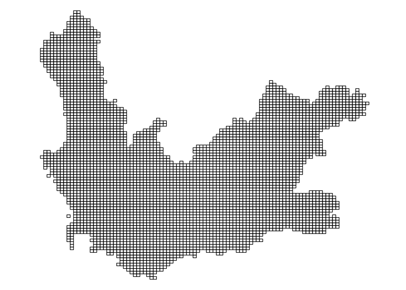
So far we have been using the ward centroids as the points for which the geographically weighted statistics are calculated. There is no requirement to do this as they could be interpolated at any point within this study region. To demonstrate this, let’s reselect the wards in the Western Cape and convert them into a raster grid using the stars package. Stars is an abbreviation of spatial-temporal arrays and can be used for handling raster (gridded) data, as in the following example, which is taken from this introduction to the package.
We will use the st_rasterize function in stars to convert the geography of South Africa’s Western Cape into a regular grid.
Code
wcape_wards |>st_rasterize(nx =100, ny =100) |>st_as_sf() -> griddedpar(mai=c(0,0,0,0))gridded |>st_geometry() |>plot()
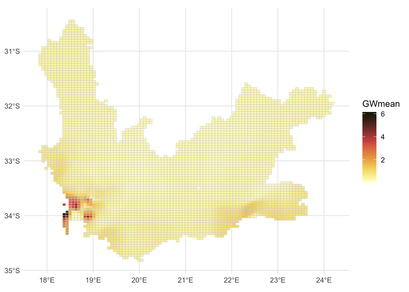
We can now calculate the geographically weighted mean for each raster cell, with a bandwidth of 20 nearest neighbours.
Code
gridded_sp <-as_Spatial(gridded)gwstats <-gwss(wcape_wards_sp, gridded_sp, vars ="High_income",bw =20, kernel ="bisquare",adaptive =TRUE, longlat = T)gridded$GWmean <- gwstats$SDF$High_income_LMggplot(gridded, aes(fill = GWmean)) +geom_sf(col ="transparent", size =0) +# size is the width of the raster cell borderscale_fill_continuous_c4a_seq(palette ="scico.lajolla") +theme_minimal()
Using geography to interpolate missing values
This ability to interpolate at any point within the study region provides a means to deal with missing values in the data. Contained in the wcape_wards data is a variable giving the average age of the population in each ward in 2011 but it contains 15 missing values:
Code
summary(wcape_wards$age)
   Min. 1st Qu.  Median    Mean 3rd Qu.    Max.    NA's
  24.90   27.95   29.80   30.91   33.00   51.30      15
The same observations also record NAs for the No_schooling variable. These are the rows of the data with missing values:
Missing value are a problem when fitting a regression model (line of best fit), for example. Usually they are simply omitted, as in the following case, where the output reports “(15 observations deleted due to missingness)”.
Code
ols1 <-lm(No_schooling ~ age, data = wcape_wards)summary(ols1)
Call:
lm(formula = No_schooling ~ age, data = wcape_wards)

Residuals:
    Min      1Q  Median      3Q     Max
-9.7037 -2.1998 -0.5384  1.7687 13.2843

Coefficients:
            Estimate Std. Error t value Pr(>|t|)
(Intercept) 19.69367    1.14121   17.26   <2e-16 ***
age         -0.38835    0.03657  -10.62   <2e-16 ***
---
Signif. codes:  0 '***' 0.001 '**' 0.01 '*' 0.05 '.' 0.1 ' ' 1

Residual standard error: 3.064 on 385 degrees of freedom
  (15 observations deleted due to missingness)
Multiple R-squared:  0.2265,    Adjusted R-squared:  0.2245
F-statistic: 112.8 on 1 and 385 DF,  p-value: < 2.2e-16
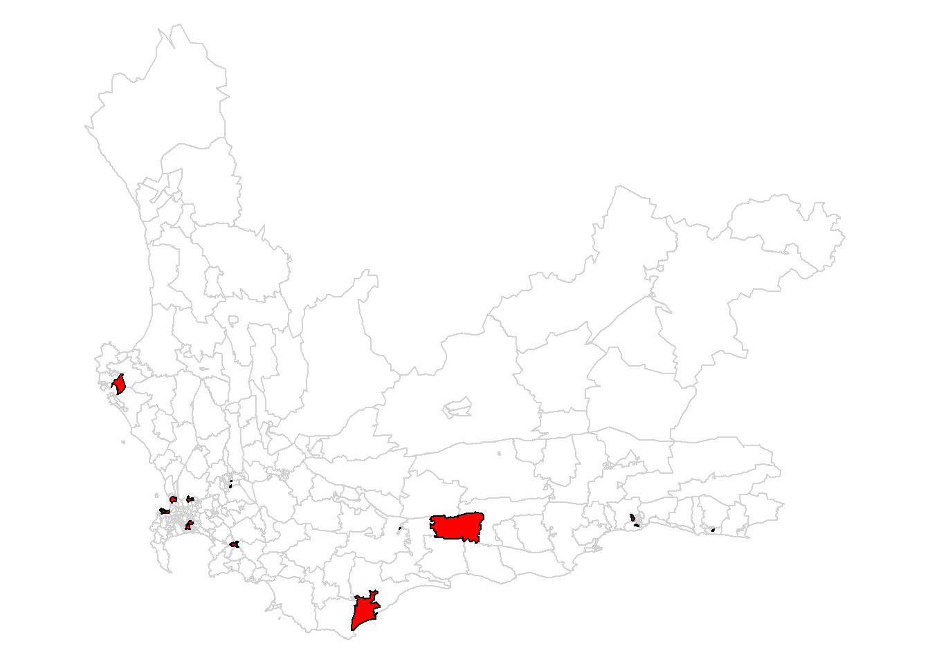
An alternative approach to just automatically deleting them is to replace the missing values with a ‘safe’ alternative such as the mean of the values that are not missing for the variable. However, we could also replace each missing value with a locally interpolated mean which fits with the geographical context.
Here are the wards with missing age and no schooling values. These are the points that need to be interpolated.
Fortunately, the missing values seem to be fairly randomly distributed across the study region. It would be a problem if they were all geographically clustered together because interpolating their values from their neighbours would not be successful if their neighbours’ values were also missing!
We can, then, interpolate the missing values from the present ones and match them into the data using base R’s match() function, matching on their WardID. Note that I have done this twice, once for the age variable and once for No_schooling. This is to allow for the possibility of them having differently sized bandwidths from each other (which they do when using approach = "AIC", although not, as it happens, with the default approach = "CV").
Now returning to our regression model, there are, of course, no longer any missing values and, reassuringly, no evidence that the interpolated values are significantly different from the rest in either their mean No_schooling value or in their effect of age upon No_schooling (I reach this conclusion by seeing that the variable interpolatedTRUE and the effect of the interpolation on age, age:interpolation are not significant).
Call:
lm(formula = No_schooling ~ age + interpolated + age:interpolated,
    data = wcape_wards)

Residuals:
    Min      1Q  Median      3Q     Max
-9.7037 -2.1709 -0.5446  1.7484 13.2843

Coefficients:
                     Estimate Std. Error t value Pr(>|t|)
(Intercept)          19.69367    1.12855  17.450   <2e-16 ***
age                  -0.38835    0.03617 -10.738   <2e-16 ***
interpolatedTRUE     -1.72125   10.95102  -0.157    0.875
age:interpolatedTRUE  0.02817    0.34961   0.081    0.936
---
Signif. codes:  0 '***' 0.001 '**' 0.01 '*' 0.05 '.' 0.1 ' ' 1

Residual standard error: 3.03 on 398 degrees of freedom
Multiple R-squared:  0.2285,    Adjusted R-squared:  0.2226
F-statistic: 39.28 on 3 and 398 DF,  p-value: < 2.2e-16
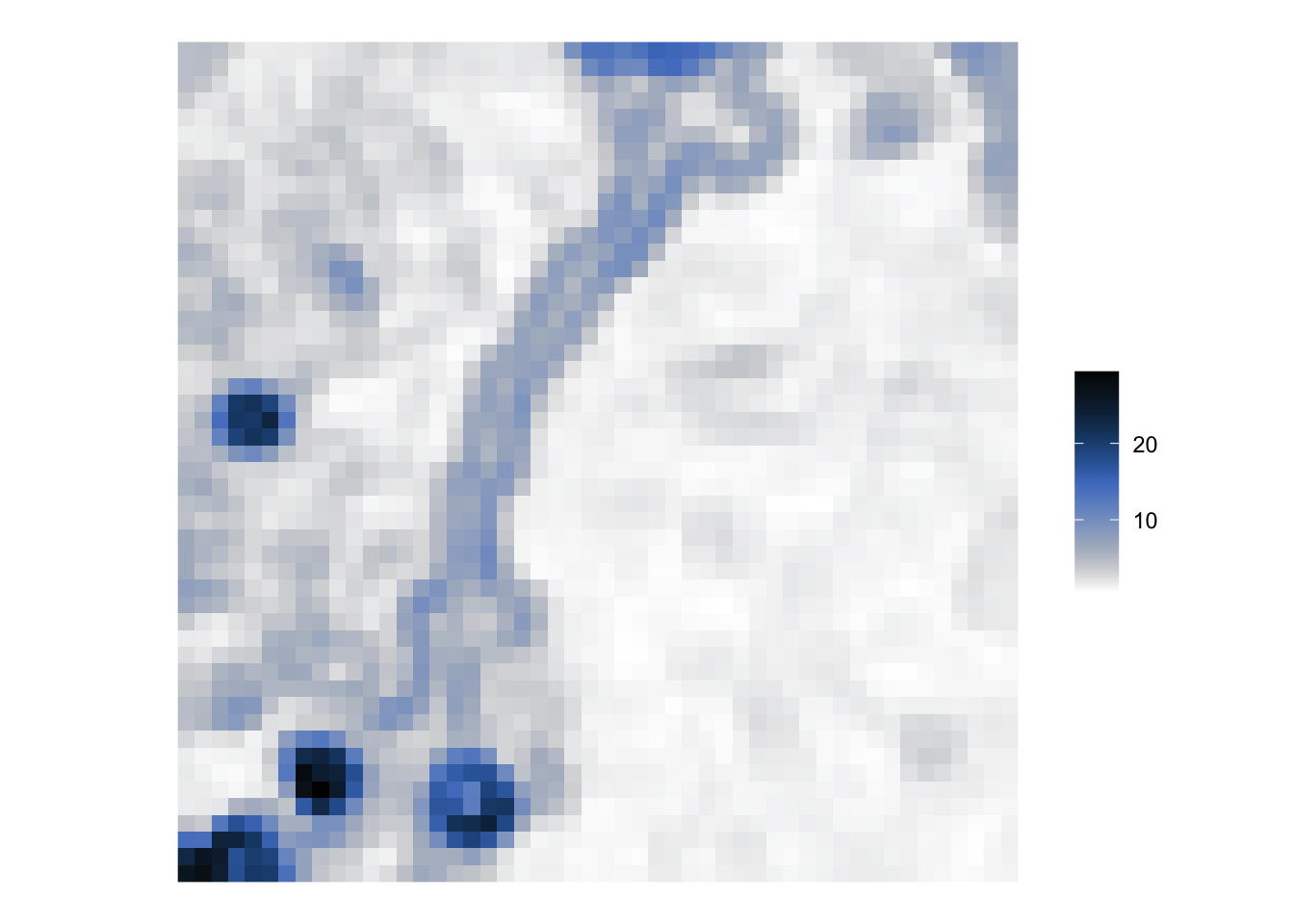
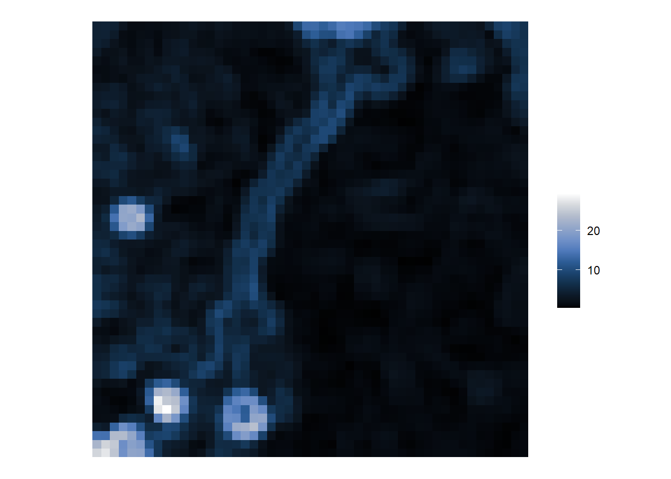
The geographically weighted mean as a low pass filer
The geographically weighted mean acts as a smoothing (low pass) filter. We can see this if we apply it to a part of the satellite image from earlier. (If you try it on the whole image, you will be waiting a long time for the bandwidth to be calculated).
First we shall extract band 1 from the image, create a blank raster using the raster package and assign it the same values as from the image.
r <- raster::raster(nrows =352, ncol =349,xmn =288776.3, xmx =298722.8,ymn =9110728.8, ymx =9120760.8)raster::crs(r) <-"EPSG:31985"# The image is 349 (row) by 352 (col) whereas the raster is# 352 (col) by 349 (row) which is why the values are transposed, t(vals)r <- raster::setValues(r, t(vals))
Next we will crop out the top-left hand corner of the image, convert the coordinates and the attributes of those raster cells into a SpatialPointsDataFrame for use with the GWmodel functions and calculate the geographically weighted statistics:
However, it isn’t only the geographically weighted mean that is calculated. You could use the geographically weighted standard deviation, for example, as a high pass filter – a form of edge detection.
You might spot that I have not loaded (required) the raster package in the code above but have accessed its functions via the :: notation; for example raster::setValues(). That is because if I do load the package, its select function will then mask a different function but with the same name in tidyverse’s dplyr. As I am only using the raster package very briefly, I didn’t think it was worth the potential confusion.
Geographically weighted correlation
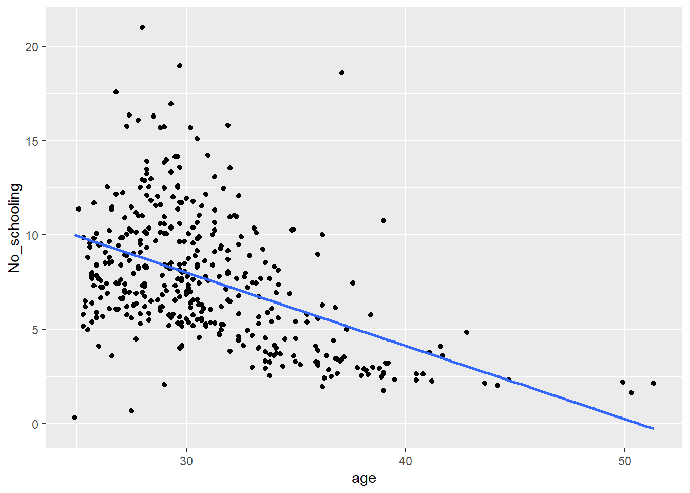
According to the regression model earlier, there is a negative correlation between the age of the population and the percentage without schooling. The correlation across the Western Cape is,
Code
cor(wcape_wards$No_schooling, wcape_wards$age)
[1] -0.4756981
That is, however, the global correlation for what appears (below) to be a heteroscedastic relationship. Heteroscedastic means that the variation of the points is not constant around the regression line (line of best fit) – in the plot below, there is more variation to the left of the chart than to the right of it.
Code
ggplot(data = wcape_wards, aes(x = age, y = No_schooling)) +geom_point() +geom_smooth(method ="lm", se =FALSE)
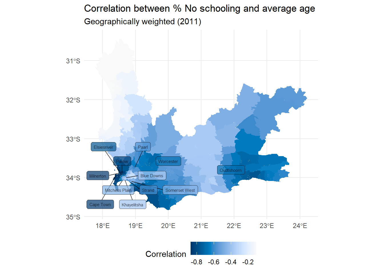
Sometimes heteroscedasticity is indicative of a geographically varying relationship so let’s consider that by calculating and mapping the geographically weighted correlations between the two variables.
Code
wcape_wards_sp <-as_Spatial(wcape_wards)bw <-bw.gwr(No_schooling ~ age, data = wcape_wards_sp,adaptive =TRUE, kernel ="bisquare", longlat = T)gwstats <-gwss(wcape_wards_sp, vars =c("No_schooling", "age"), bw = bw,kernel ="bisquare",adaptive =TRUE, longlat = T)wcape_wards$Corr_No_schooling.age <- gwstats$SDF$Corr_No_schooling.ageggplot(wcape_wards, aes(fill = Corr_No_schooling.age)) +geom_sf(col ="transparent") +scale_fill_continuous_c4a_seq(name ="Correlation", palette ="hcl.blues3",reverse =FALSE) +theme_minimal() +theme(legend.position="bottom") +labs(title ="Correlation between % No schooling and average age",subtitle ="Geographically weighted (2011)" )
The local correlations range -0.868 to -0.105, with an interquartile range from -0.714 to -0.451:
Code
summary(wcape_wards$Corr_No_schooling.age)
   Min. 1st Qu.  Median    Mean 3rd Qu.    Max.
-0.8679 -0.7136 -0.6294 -0.5801 -0.4506 -0.1054
If we add a little ‘cartographic know-how’ from an earlier session, we can identify that the correlation is stronger in and around Parow than it is in and around Blue Downs, for example.
Code
if(!("remotes"%in% installed)) install.packages("remotes",dependencies =TRUE)if(!("ggsflabel"%in% installed)) remotes::install_github("yutannihilation/ggsflabel")require(ggsflabel)if(!file.exists("hotosm_zaf_populated_places_points.shp")) {download.file("https://github.com/profrichharris/profrichharris.github.io/blob/main/MandM/boundary%20files/hotosm_zaf_populated_places_points_shp.zip?raw=true","cities.zip", mode ="wb", quiet =TRUE)unzip("cities.zip")}read_sf("hotosm_zaf_populated_places_points.shp") |>filter(place =="city"| place =="town") |>st_join(wcape_wards) |># A spatial spatial join,# giving the point places the attributes of the wards they fall inmutate(population =as.integer(population)) |>filter(!is.na(ProvinceNa) & population >60000) -> placeslast_plot() +geom_sf_label_repel(data = places, aes(label = name), alpha =0.7,force =5, size =2, max.overlaps =20) +xlab(element_blank()) +ylab(element_blank())
In general, the correlation appears to be strongest in cities:
# A tibble: 5 × 2
  place             meancorr
  <chr>                <dbl>
1 city                -0.855
2 hamlet              -0.620
3 isolated_dwelling   -0.572
4 village             -0.555
5 town                -0.514
Statistical inference and significance
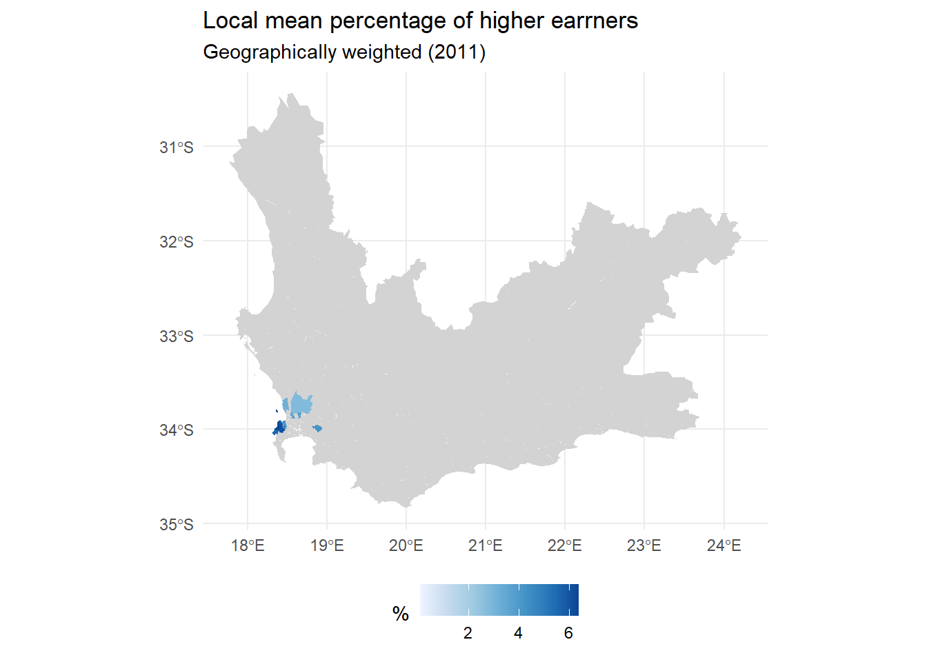
We can use a randomisation procedure to determine whether any of the local summary statistics may be said to be significantly different from those obtained by chance. The randomisation procedure is found in the function, gwss.montecarlo() with a default number of nsim = 99 simulations. This isn’t very many but they are time-consuming to calculate and will be sufficient to demonstrate the process.
The following code chunk returns to the local mean percentages of high earners. It goes through the complete process of determining a bandwidth using the bw.gwr() function, then calculating the local and geographically weighted statistics using gwss(), determining the p-values under randomisation, using gwsss.montecarlo, then mapping the results. Very few of the results would be adjudged significant but a few are.
Calculating the p-values under randomisation takes some time so please be patient.
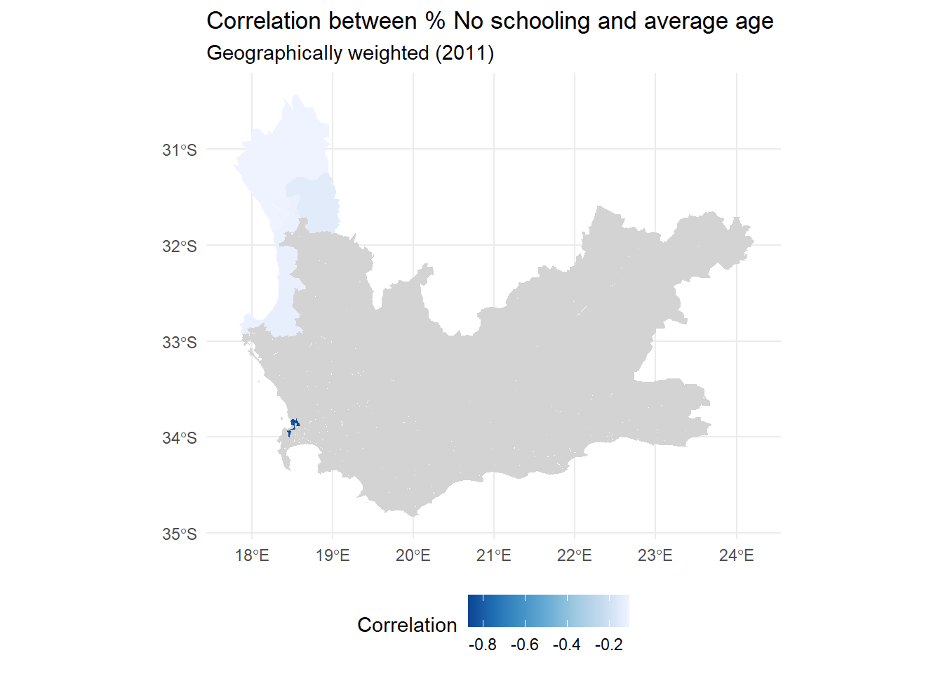
A second example considers the local correlations between the No_schooling and age variables. Again, most of the correlations are insignificant but with a few exceptions.
gwstats <-gwss(wcape_wards_sp , vars =c("No_schooling", "age"), bw = bw,kernel ="bisquare",adaptive =TRUE, longlat = T)p.values <-gwss.montecarlo(wcape_wards_sp, vars =c("No_schooling", "age"),bw = bw, kernel ="bisquare",adaptive =TRUE, longlat = T)p.values <-as.data.frame(p.values)wcape_wards$Corr_No_schooling.age <- gwstats$SDF$Corr_No_schooling.agewcape_wards$Corr_No_schooling.age[p.values$Corr_No_schooling.age >0.025& p.values$Corr_No_schooling.age <0.975] <-NAggplot(wcape_wards, aes(fill = Corr_No_schooling.age)) +geom_sf(col ="transparent") +scale_fill_distiller("Correlation", palette ="Blues",na.value ="light grey") +theme_minimal() +theme(legend.position="bottom") +labs(title ="Correlation between % No schooling and average age",subtitle ="Geographically weighted (2011)" )
We have the problem of repeating testing that we also had when looking for spatial hotspots in the session about spatial autocorrelation. The function p.adjust() could be used but we may wonder, as previously, whether the methods are too conservative.
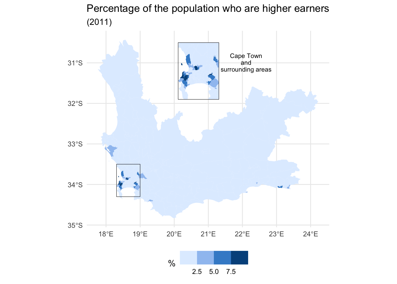
Improving the leigibility of the map
The final part of this session is not about geographically weighted statistics or their applications but returns to thinking about mapping, to address the problem that some parts of some map are so small that their contents are almost illegible (too small to be seen).
Using a map insert
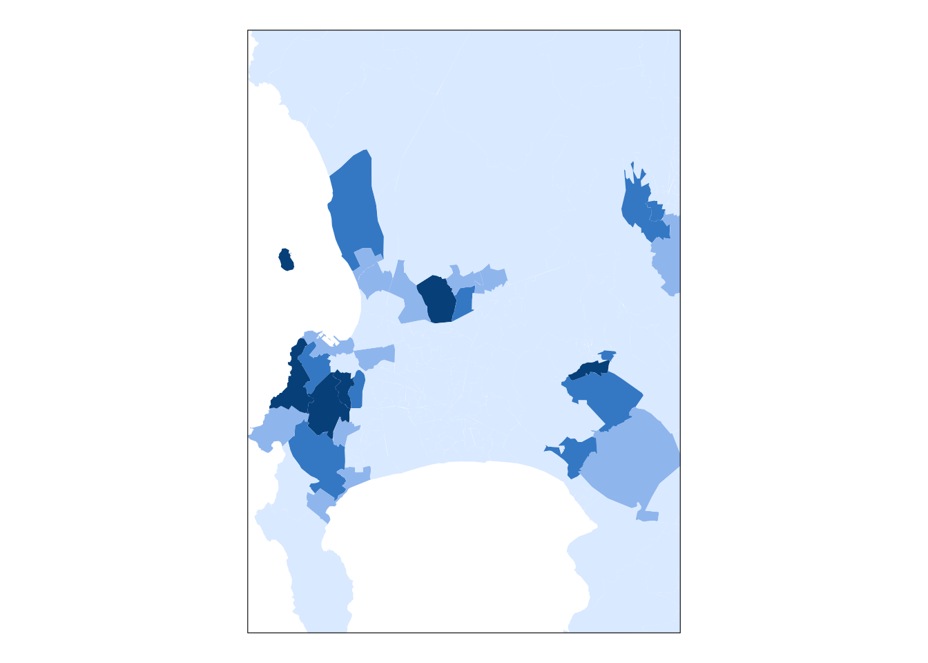
The traditional and probably the most effective way to address the problem mentioned above is to add one or more inserts to the map to magnify the small areas. One way to do this is by using the cowplot package with ggplot2. The following example is based on this tutorial and maps the percentages of the populations who are relatively high earners in each ward.
First, we need to install and require the cowplot package.
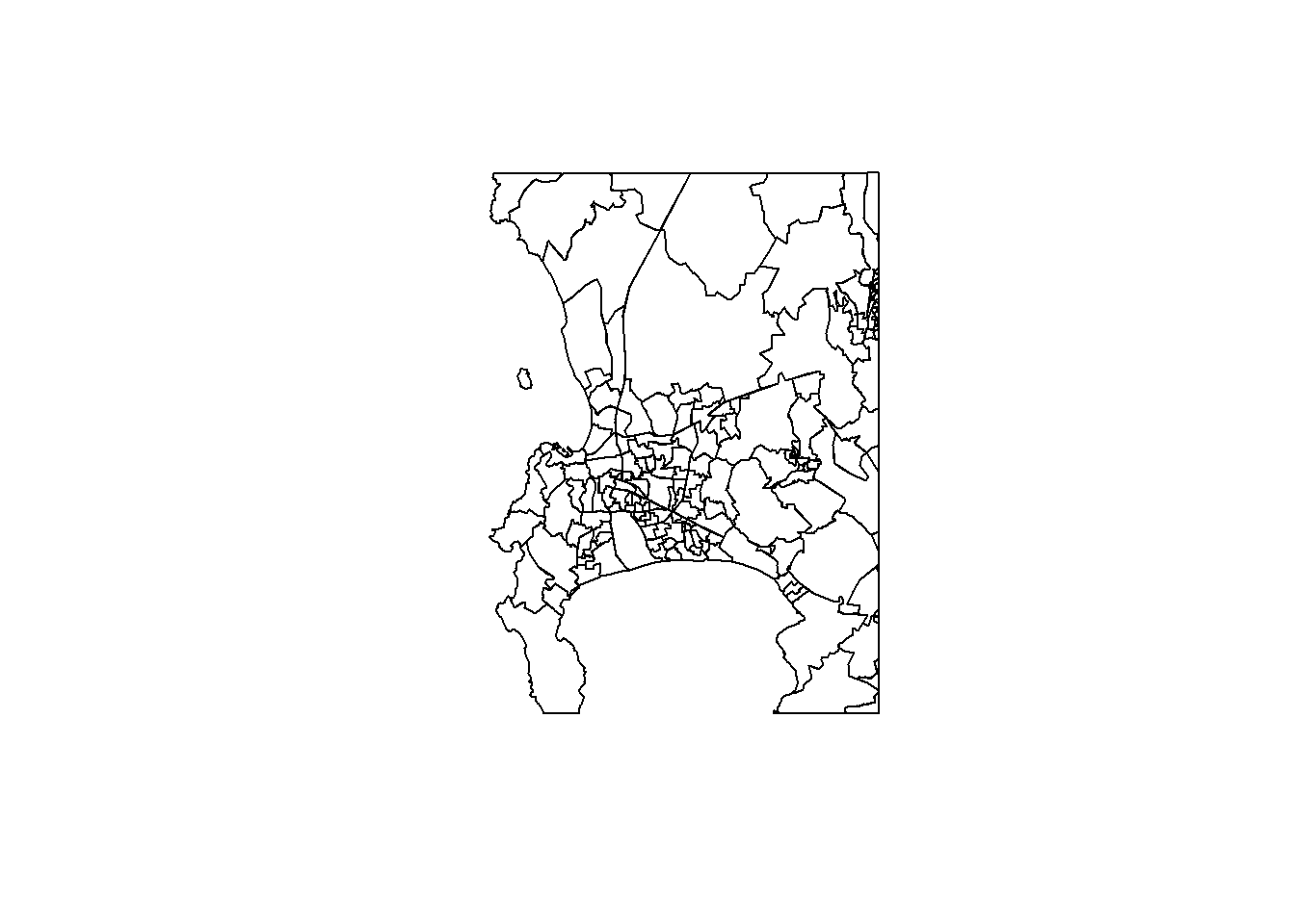
The bounding box for the extracted area is also obtained as it will be used as a feature in the final map (it will be drawn as a rectangle showing the geographical extent of the insert in the original map).
Code
bbox <-st_as_sfc(st_bbox(wards_extract))
Next, the main part of the map is created…
Code
main_map <-ggplot(wcape_wards, aes(fill = High_income)) +geom_sf(col ="transparent") +scale_fill_binned_c4a_seq(name ="%", palette ="hcl.blues3") +geom_sf(data = bbox, fill =NA, col ="black", size =1.2) +theme_minimal() +theme(legend.position="bottom") +labs(title ="Percentage of the population who are higher earners",subtitle ="(2011)" )plot(main_map)
Finally, the maps are brought together using cowplot’s ggdraw() and draw_plot() functions. We know that some of the values it shows are not necessarily significant under randomisation but we will include them here anyway, just of the purpose of demonstration.
Code
ggdraw() +draw_plot(main_map) +draw_plot(insert, x =0, y =0.25, scale =0.22) +draw_label("Cape Town\nand\nsurrounding areas", x =0.62, y =0.78, size =8)
The positioning of the map insert (x = ... & y = ...), the scaling of it, and the size and position of the label were all found by trial and error, using various values until I was happy with the results.
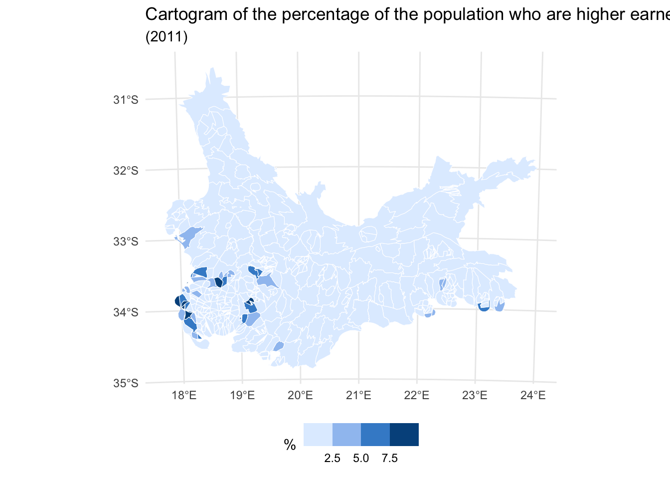
Using a ‘balanced cartogram’
Another approach is to use what has been described as a visually balanced cartogram, based on the idea of cartograms that we looked at in a previous session.
The problem with cartograms is the distortion. Essentially, they are trading one visual problem (invisibility of small areas) for another (the amount of geographical distortion). The idea of a balanced cartogram comes from an awareness that sometimes it is sufficient just to make the small areas bigger and/or the big areas smaller, without causing too much geographical distortion. One way to achieve this is to scale the places by the square root of the original areas, as in the following example.
Code
if(!("cartogram"%in% installed)) install.packages("cartogram",dependencies =TRUE)require(cartogram)# Convert from longitude/latitude to a grid projectionwcape_wards %>%st_transform(22234) %>%mutate(area =as.numeric(st_area(.)),w =as.numeric(sqrt(area))) -> wards_prj# Create the cartogram -- here a contiguous cartogram is used, see ?cartogram# This might take a minute or twowards_carto <-cartogram_cont(wards_prj, weight ="w", maxSizeError =1.4,prepare ="none")ggplot(wards_carto, aes(fill = High_income)) +geom_sf(col ="white", size =0.1) +scale_fill_binned_c4a_seq(name ="%", palette ="hcl.blues3") +theme_minimal() +theme(legend.position="bottom") +labs(title ="Cartogram of the percentage of the population who are higher earners",subtitle ="(2011)" )
The results are ok, drawing attention to the wards with higher percentages of higher earners but clearly there is geographical distortion in the map, too.
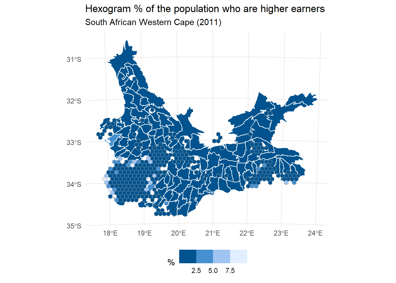
Using a hexogram
The final approach to be considered here is what has been described as hexograms – a combination of tile maps and cartograms that make small areas bigger on the map but try and limit the geographic distortion. The original method also preserved typology (i.e. contiguous neighbours remained so in the final map) but is dated and very slow to operationalise as it was really just a proof of concept. A faster method but one that cannot guarantee to preserve typology is presented below. Don’t worry about the details especially. The code is included just to show you a method.
First, we need some functions to create the hexogram.
Code
if(!("cartogram"%in%installed.packages()[,1])) install.packages("cartogram")if(!("sf"%in%installed.packages()[,1])) install.packages("sf")if(!("lpSolve"%in%installed.packages()[,1])) install.packages("lpSolve") require(sf)create_carto <- \(x, w =NULL, k =2, itermax =25, maxSizeError =1.4) {if(class(x)[1] !="sf") stop("Object x is not of class sf")if(is.null(w)) x$w <-as.numeric(st_area(x))^(1/k) cartogram::cartogram_cont(x, "w", itermax = itermax,maxSizeError = maxSizeError, prepare ="none")}create_grid <- \(x, m =6) { bbox <-st_bbox(x) ydiff <- bbox[4] - bbox[2] xdiff <- bbox[3] - bbox[1] n <- m *nrow(x) ny <-sqrt(n / (xdiff/ydiff)) nx <- n / ny nx <-ceiling(nx) ny <-ceiling(ny) grd <-st_sf(st_make_grid(x, n =c(nx, ny), square =FALSE))}grid_data <- \(x, grd, k =2) { x_pts <-st_centroid(st_geometry(x), of_largest_polygon =TRUE) grd_pts <-st_centroid(grd) cost.mat <-st_distance(x_pts, grd_pts)^k row.rhs <-rep(1, length(x_pts)) col.rhs <-rep(1, nrow(grd_pts)) row.signs <-rep("=", length(x_pts)) col.signs <-rep("<=", nrow(grd_pts)) optimisation <- lpSolve::lp.transport(cost.mat, "min", row.signs, row.rhs, col.signs, col.rhs)$solution mch <-sapply(1:nrow(optimisation), \(i) which(optimisation[i, ] ==1)) grd <-st_sf(grd[mch,])cbind(grd, st_drop_geometry(x))}create_layers <- \(x, grd) { area <-sapply(1:nrow(x), \(i) { y <-st_intersects(x[i, ], grd)[[1]]if(i %in% y) {if(length(y) ==1) return(st_area(x[i, ]))if(length(y) >1) { area <-st_area(x[i, ]) overlaps <- y[-(y == i)] area <- area -sum(st_area(st_intersection(st_geometry(x[i, ]),st_geometry(grd[overlaps, ]))))return(area) } } else {return(0) } }) i <-which(area >2*as.numeric(st_area(grd))[1])list(x[i, ], grd[-i, ])}
Next, we run through the stages of its creation, which are to start with a balanced cartogram (create_carto()), then overlay that with a grid of hexagons (create_grid()), next assign places in the original map to a hexagon (grid_data()), then plot the results as two layers (create_layers()) to give a mash-up of the cartogram and the hexagons.
Code
wards_carto <-create_carto(wards_prj)grd <-create_grid(wards_carto)wards_grid <-grid_data(wards_carto, grd)wards_layers <-create_layers(wards_carto, wards_grid)ggplot() +geom_sf(data = wards_layers[[1]], aes(fill = High_income),col ="white", size =0.4) +geom_sf(data = wards_layers[[2]], aes(fill = High_income),col ="dark grey") +scale_fill_binned_c4a_seq(name ="%", palette ="hcl.blues3") +theme_minimal() +theme(legend.position ="bottom") +labs(title ="Hexogram % of the population who are higher earners",subtitle ="South African Western Cape (2011)" )
I find the result quite visually appealing and it isn’t just me: a separate study has provided empirical evidence for the value of balanced cartograms and hexograms as a visualisation tool mapping spatial distributions. I have been playing around with a more sophisticated implementation of the code recently to try and map the changing ethnic diversity of all the census neighbourhoods in England and Wales.
Summary
This session has introduced the concept of geographically weighted statistics to examine spatial heterogeneity in a measured variable and to allow for the possibility that its strength (and direction) of correlation with another variable varies from place-to-place. As such, these statistics are a form of local statistic, which is to say they can vary across the map. Sometimes, the parts of the map that we are interested in are small in relation to other parts, creating a problem of invisibility/legibility. Maps inserts, balanced cartograms and hexograms have been introduced as a means to address this visualisation problem.
Futher reading
Gollini I, Lu B, Charlton M, Brunsdon C & Harris P (2015). GWmodel: An R Package for Exploring Spatial Heterogeneity Using Geographically Weighted Models. Journal of Statistical Software, 63(17), 1–50. https://doi.org/10.18637/jss.v063.i17
Brunsdon C, Comber A, Harris P, Rigby J & Large A (2021). In memoriam: Martin Charlton. Geographical Analysis, 54(4), 713–4. https://doi.org/10.1111/gean.12309
Source Code
---title: "Geographically Weighted Statistics"execute: warning: false message: false---```{r}#| include: falseinstalled <-installed.packages()[,1]pkgs <-c("GWmodel", "proxy", "sf", "sp", "tidyverse", "tmap", "stars", "raster", "remotes", "cowplot","cartogram", "lpSolve", "colorspace", "cols4all")install <- pkgs[!(pkgs %in% installed)]if(length(install)) install.packages(install, dependencies =TRUE, repos ="https://cloud.r-project.org")```## IntroductionIn the previous session we looked at identifying and measuring patterns of spatial autocorrelation (clustering) in data. If those patterns exist then there is potential to use them to our advantage by 'pooling' the data for geographical sub-spaces of the map, creating local summary statistics for those various parts of the map, and then comparing those statistics to look for spatial variation (spatial heterogeneity) across the map and in the data. The method we shall use here is found in `GWmodel` -- [an R Package for Exploring Spatial Heterogeneity Using Geographically Weighted Models](https://www.jstatsoft.org/article/view/v063i17){target="_blank"}. These are geographically weighted statistics.Broadly, there are three parts to this session, which are:- Introducing Geographically Weighted Statistics and how they work- Giving some applications of Geographically Weighted Statistics- Thinking a bit more about mapping data and the problem of 'invisibility' (small areas) in some maps.The first two of these are directly related to Geographically Weighted Statistics. The third is more generally related to presenting and communicating results.## Geographical Weighted StatisticsThe idea behind geographically weighted statistics is simple. For example, instead of calculating the (global) mean average for all of the data, and therefore for the whole map, a series of (local) averages are calculated for various sub-spaces within the map. Those location specific averages can then be compared.It works likes this. Imagine a point location, $i$, at position $(u_i, v_i)$ on the map. To calculate the local statistic:- First find either the $k$ nearest neighbours to $i$ or all of those within a fixed distance, $d$, from it. In this way, we are defining $i$'s neighbours.- Second, to add the geographical weighting, apply a weighting scheme whereby the neighbours nearest to $i$ have most weight in the subsequent calculations, and the weights decrease with increasing distance from $i$, becoming zero at the $k$th nearest neighbour or at the distance threshold, $d$. Here we are defining spatial weights.- Third, calculate, for the point and its neighbours, the weighted mean value (or some other summary statistic) of a variable, using the inverse distance weighting (the spatial weights) in the calculation.- Fourth, repeat the process for other points on the map. This means that if there are $n$ points of calculation then there will be $n$ geographically weighted mean values calculated across the map that can be compared to look for spatial variation. Often those $n$ points will be the centroids of the regions or neighbourhoods (or whatever) that are being studied. But, they do not have to be.Let's see this in action, beginning by ensuring the necessary packages are installed and required. As with previous sessions, you might start by opening the R Project that you created for these classes.```{r}installed <-installed.packages()[,1]pkgs <-c("colorspace", "cols4all", "GWmodel", "proxy", "sf", "sp","tidyverse", "tmap")install <- pkgs[!(pkgs %in% installed)]if(length(install)) install.packages(install, dependencies =TRUE)invisible(lapply(pkgs, require, character.only =TRUE))```{width=75}<font size = 3>`sp` and its associated packages have been retired in favour of `sf` and others. The reason for requiring it here is that the `GWmodel` package that we will use for the geographically weighted statistics still uses it.</font></br>We will use the same data as in the previous session but confine the analysis to the Western Cape of South Africa. This is largely to reduce run times but there is another reason that I shall return to presently.```{r}download.file("https://github.com/profrichharris/profrichharris.github.io/blob/main/MandM/workspaces/wards.RData?raw=true", "wards.RData", mode ="wb", quiet =TRUE)load("wards.RData")wards |>filter(ProvinceNa =="Western Cape") -> wcape_wards```The calculation points for the geographically weighted statistics will be the ward centroids. A slight complication here is that `GWmodel` presently is built around the elder `sp` not `sf` formats for handling spatial data in R so the wards need to be converted from the one format to the other.```{r}wcape_wards_sp <-as_Spatial(wcape_wards)```We can see that `wcape_wards` is of class `sf`,```{r}class(wcape_wards)```whereas `wcape_wards_sp` is now of class `SpatialPolygonsDataFrame`, which is what we want.```{r}class(wcape_wards_sp)```Having made the conversion we are ready to calculate some geographically weighted statistics, doing so for the `High_income` variable -- the percentage of the population with income R614401 or greater in 2011 -- in the example below.```{r}gwstats <-gwss(wcape_wards_sp , vars ="High_income", bw =10,kernel ="bisquare",adaptive =TRUE, longlat = T)```The results are contained in the spatial data frame (`$SDF`),```{r}as_tibble(gwstats$SDF) |>print(n =5)```As well as the **local** means (LM), the local standard deviations (LSD), variances (LVar), skews (LSke) and coefficients of variation (LCV) are included (the coefficient of variation is the ratio of the standard deviation to the mean). The local medians (Median), interquartile ranges (IQR) and quantile imbalances (QI) can also be added by including the argument `quantile = TRUE` in `gwss()`:```{r}gwstats <-gwss(wcape_wards_sp , vars ="High_income", bw =10,kernel ="bisquare",adaptive =TRUE, longlat = T,quantile =TRUE)as_tibble(gwstats$SDF) |>print(n =5)```The results are dependent on the data (of course) but also- the kernel (i.e. the 'shape' of the geographic weighting -- the distance decay -- around each point), and- the bandwidth (i.e. the maximum number of neighbours to include, $k$ or the distance threshold, $d$).The kernel matters...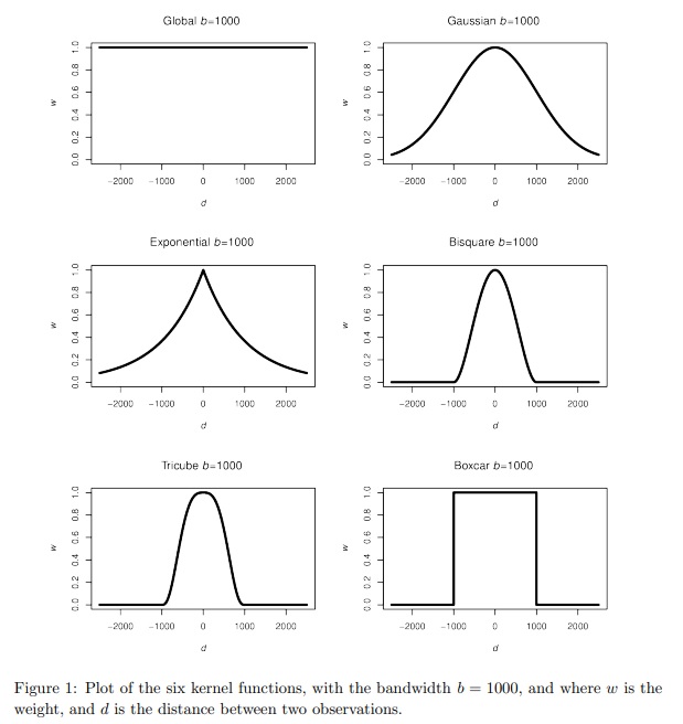<font size = 2>Source: [GWmodel: An R Package for Exploring Spatial Heterogeneity Using Geographically Weighted Models](https://www.jstatsoft.org/article/view/v063i17){target="_blank}</font>... but it (usually) matters less than the bandwidth, which controls the amount of spatial smoothing: the larger it is, the more neighbours are being averaged over. The trade-off is between bias and precision. A smaller bandwidth is less likely to average-out geographical detail in the data and should create geographically weighted statistics that are representative of the location at the centre of the kernel but are also dependent on a small number of observations, some or more of which could be in error or be unusual for that part of the map.The following maps compare a bandwidth of $bw = 10$ nearest neighbours to $bw = 100$. If you zoom into the areas around the north of Cape Town you will see some of the differences. Note that the argument `adaptive = TRUE` sets the bandwidth to be in terms of nearest neighbours, else it would indicate a fixed distance of 10 metres. The advantage of using nearest neighbours is it allows for varying population densities. Otherwise, when using a fixed distance, more rural areas will tend to have fewer neighbours than urban ones because those rural areas are larger and more spaced apart.```{r}gwstats <-gwss(wcape_wards_sp , vars ="High_income", bw =10,kernel ="bisquare",adaptive =TRUE, longlat = T)wcape_wards$bw10 <- gwstats$SDF$High_income_LMgwstats <-gwss(wcape_wards_sp , vars ="High_income", bw =100,kernel ="bisquare",adaptive =TRUE, longlat = T)wcape_wards$bw100 <- gwstats$SDF$High_income_LMwards2 <-pivot_longer(wcape_wards, cols =starts_with("bw"), names_to ="bw",values_to ="GWmean")tmap_mode("view")tm_basemap("OpenStreetMap") +tm_shape(wards2, name ="wards") +tm_polygons(fill ="GWmean",fill.scale =tm_scale_intervals(values ="brewer.reds", n =5, style ="equal" ),fill_alpha =0.7,fill.legend =tm_legend(title ="%",format =list(digits =1, suffix ="%") ),id ="District_1",popup.vars =c("GW mean:"="GWmean", "Ward ID:"="WardID"),popup.format =tm_label_format(digits =1) ) +tm_borders() +tm_facets(by ="bw") +tm_title("Geographically weighted % population with income R614,401 or greater")```{width=75}<font size = 3>A nice feature of the facetting (`tm_facets`) in `tmap` is it has created two dynamically linked maps.</font>Here is a version of the maps using `ggplot()`.```{r}library(ggplot2)ggplot(wards2) +geom_sf(aes(fill = GWmean), colour =NA) +scale_fill_distiller(type ="seq",palette ="Reds",direction =1,name ="%" ) +facet_wrap(~ bw) +theme_minimal(base_size =10) +labs(title ="Geographically weighted % population with income ≥ R614,401", )```</br>### A slight tangentYou may note the use of the `pivot_longer` function from the `tidyverse` packages in the code above. To see what this does, take a look at,```{r}wcape_wards |>st_drop_geometry() |>select(WardID, bw10, bw100) |>arrange(WardID) |>head(n =3)```Now compare it with,```{r}wcape_wards |>st_drop_geometry() |>select(WardID, bw10, bw100) |>pivot_longer(cols =starts_with("bw"), names_to ="bw",values_to ="GWmean") |>arrange(WardID) |>head(n =6)```What you can see is that the two columns, `bw10` and `bw100` from the first table have been stacked into rows in the second. This takes the table from a wide format to a long one, hence the function name `pivot_longer()`. Doing this allows us to create the two linked plots by faceting on the bandwidth variable, `bw`, using `tm_facets(by = "bw")`. The reverse operation to `pivot_longer()` is `pivot_wider()` -- see `?pivot_wider`. ### 'Pre-calculating' the distance matrixIn the calculations above, the distances between the ward centroids that are used in the geographical weighting were calculated twice. First in `gwss(wcape_wards_sp, vars = "High_income", bw = 10, ...)` and then again in `gwss(wcape_wards_sp, vars = "High_income", bw = 100, ...)`. Since those distances don't actually change -- the centroids are fixed so therefore are the distances between them -- so we might have saved a little computational time by calculating the distance matrix in advance and then using it in the geographically weighted statistics. Curiously, though, it actually takes longer. I assume this is because the data set isn't large enough to justify the extra step of saving the distances in a matrix and then passing that matrix to the `gwss()` function.```{r}# Time to do the calculations without pre-calculating the distance matrixsystem.time({ gwstats <-gwss(wcape_wards_sp , vars ="High_income", bw =10,kernel ="bisquare",adaptive =TRUE, longlat = T) wcape_wards$bw10 <- gwstats$SDF$High_income_LM gwstats <-gwss(wcape_wards_sp , vars ="High_income", bw =100,kernel ="bisquare",adaptive =TRUE, longlat = T) wcape_wards$bw100 <- gwstats$SDF$High_income_LM})# Time to do the calculations with the pre-calculated distance matrixsystem.time({ coords <-st_coordinates(st_centroid(wcape_wards)) dmatrix <-gw.dist(coords, longlat = T) gwstats <-gwss(wcape_wards_sp , vars ="High_income", bw =10,kernel ="bisquare",adaptive =TRUE, longlat = T, dMat = dmatrix) wcape_wards$bw10 <- gwstats$SDF$High_income_LM gwstats <-gwss(wcape_wards_sp , vars ="High_income", bw =100,kernel ="bisquare",adaptive =TRUE, longlat = T, dMat = dmatrix) wcape_wards$bw100 <- gwstats$SDF$High_income_LM})```## Selecting the bandwidthAs observed in the maps above, the geographically weighted statistics are a function of the geographical weighting that largely is controlled by the bandwidth. This raises the question of which is the correct bandwidth to use? Unfortunately, the most honest answer is that there is no correct answer, although an automatic bandwidth selection might be tried by calibrating the statistics around the local means.The following uses a cross-validation approach,```{r}bw <-bw.gwr(High_income ~1, data = wcape_wards_sp,adaptive =TRUE, kernel ="bisquare", longlat = T)# The selected number of nearest neighbours:bw```whereas the following uses an AIC corrected approach.```{r}bw <-bw.gwr(High_income ~1, data = wcape_wards_sp,adaptive =TRUE, kernel ="bisquare", longlat = T, approach ="AIC")bw```Both use a [golden-section search method](https://en.wikipedia.org/wiki/Golden-section_search){target="_blank"} and, if you look at the output, both iterate to a very similar solution in a very similar set of steps. Bandwidths of 17 and 20 have been suggested. In practice, there is probably little between them so we may as well use the larger.That automatic bandwidth selection applies only for the Western Cape wards, however. Recall earlier that the data were filtered (`wards |> filter(ProvinceNa == "Western Cape") -> wcape_wards`) with the partial explanation for doing so being to reduce run times. Another explanation is that there is no reason to assume that the spatial autocorrelation that is quantified by the bandwidth selection will be the same everywhere across the map. In fact, it varies from province to province:```{r}#| results: falsebandwidths <-sapply(unique(wards$ProvinceNa), \(x) { wards |>filter(ProvinceNa == x) |>as_Spatial() %>%bw.gwr(High_income ~1, data = .,adaptive =TRUE, kernel ="bisquare", longlat = T,approach ="AIC") %>%paste0("Bandwidth = ", .)})``````{r}bandwidths```This suggests that fitting geographically weighted statistics to too large a study region is not desirable because there is little reason to presume that the same bandwidth should apply throughout it. The study region may be characterised by different spatial regimes.## Changing the interpolation (calculation) pointsSo far we have been using the ward centroids as the points for which the geographically weighted statistics are calculated. There is no requirement to do this as they could be interpolated at any point within this study region. To demonstrate this, let's reselect the wards in the Western Cape and convert them into a raster grid using the [stars](https://r-spatial.github.io/stars/){target="_blank"} package. Stars is an abbreviation of spatial-temporal arrays and can be used for handling raster (gridded) data, as in the following example, which is taken from [this introduction to the package](https://r-spatial.github.io/stars/articles/stars1.html){target="_blank"}.```{r}if(!("stars"%in% installed)) install.packages("stars", dependencies =TRUE)require(stars)sat_image <-system.file("tif/L7_ETMs.tif", package ="stars")sat_image <-read_stars(sat_image)plot(sat_image, axes =TRUE)```We will use the `st_rasterize` function in `stars` to convert the geography of South Africa's Western Cape into a regular grid.```{r}wcape_wards |>st_rasterize(nx =100, ny =100) |>st_as_sf() -> griddedpar(mai=c(0,0,0,0))gridded |>st_geometry() |>plot()```We can now calculate the geographically weighted mean for each raster cell, with a bandwidth of 20 nearest neighbours.```{r}gridded_sp <-as_Spatial(gridded)gwstats <-gwss(wcape_wards_sp, gridded_sp, vars ="High_income",bw =20, kernel ="bisquare",adaptive =TRUE, longlat = T)gridded$GWmean <- gwstats$SDF$High_income_LMggplot(gridded, aes(fill = GWmean)) +geom_sf(col ="transparent", size =0) +# size is the width of the raster cell borderscale_fill_continuous_c4a_seq(palette ="scico.lajolla") +theme_minimal()```### Using geography to interpolate missing valuesThis ability to interpolate at any point within the study region provides a means to deal with missing values in the data. Contained in the `wcape_wards` data is a variable giving the average age of the population in each ward in 2011 but it contains `r length(wcape_wards$age[is.na(wcape_wards$age)])` missing values:```{r}summary(wcape_wards$age)```The same observations also record NAs for the `No_schooling` variable. These are the rows of the data with missing values:```{r}which(is.na(wcape_wards$age))which(is.na(wcape_wards$No_schooling))```Missing value are a problem when fitting a regression model (line of best fit), for example. Usually they are simply omitted, as in the following case, where the output reports "(15 observations deleted due to missingness)".```{r}ols1 <-lm(No_schooling ~ age, data = wcape_wards)summary(ols1)```</br>An alternative approach to just automatically deleting them is to replace the missing values with a 'safe' alternative such as the mean of the values that are not missing for the variable. However, we could also replace each missing value with a locally interpolated mean which fits with the geographical context.Here are the wards with missing age and no schooling values. These are the points that need to be interpolated.```{r}wcape_wards |>filter(is.na(age)) |>as_Spatial() -> missing```These are the wards with the values that serve as the data points.```{r}wcape_wards |>filter(!is.na(age)) |>as_Spatial() -> present```Fortunately, the missing values seem to be fairly randomly distributed across the study region. It would be a problem if they were all geographically clustered together because interpolating their values from their neighbours would not be successful if their neighbours' values were also missing!```{r}par(mai=c(0, 0, 0, 0))plot(present, border ="light grey")plot(missing, col ="red", add = T)```We can, then, interpolate the missing values from the present ones and match them into the data using base R's `match()` function, matching on their `WardID`. Note that I have done this twice, once for the `age` variable and once for `No_schooling`. This is to allow for the possibility of them having differently sized bandwidths from each other (which they do when using `approach = "AIC"`, although not, as it happens, with the default `approach = "CV"`).```{r}#| results: falsebw <-bw.gwr(age ~1, data = present,adaptive =TRUE, kernel ="bisquare", longlat = T,approach ="AIC")gwstats <-gwss(present, missing, vars ="age", bw = bw, kernel ="bisquare",adaptive =TRUE, longlat = T)mch <-match(missing$WardID, wcape_wards$WardID)wcape_wards$age[mch] <- gwstats$SDF$age_LMbw <-bw.gwr(No_schooling ~1, data = present,adaptive =TRUE, kernel ="bisquare", longlat = T, approach ="AIC")gwstats <-gwss(present, missing, vars ="No_schooling", bw = bw, kernel ="bisquare",adaptive =TRUE, longlat = T)wcape_wards$No_schooling[mch] <- gwstats$SDF$No_schooling_LM```It is useful to keep a note of which values are interpolated, so...```{r}wcape_wards$interpolated <-FALSEwcape_wards$interpolated[mch] <-TRUE```There should be `r length(wcape_wards$interpolated[wcape_wards$interpolated])` of them.```{r}table(wcape_wards$interpolated)```Now returning to our regression model, there are, of course, no longer any missing values and, reassuringly, no evidence that the interpolated values are significantly different from the rest in either their mean `No_schooling` value or in their effect of `age` upon `No_schooling` (I reach this conclusion by seeing that the variable `interpolatedTRUE` and the effect of the interpolation on age, `age:interpolation` are not significant).```{r}ols2 <-update(ols1, . ~ . + interpolated*age)summary(ols2)```## The geographically weighted mean as a low pass filerThe geographically weighted mean acts as a [smoothing (low pass) filter](https://desktop.arcgis.com/en/arcmap/latest/tools/spatial-analyst-toolbox/filter.htm){target="_blank"}. We can see this if we apply it to a part of the satellite image from earlier. (If you try it on the whole image, you will be waiting a long time for the bandwidth to be calculated). First we shall extract band 1 from the image, create a blank raster using the [raster package](https://cran.r-project.org/web/packages/raster/index.html){target="_blank"} and assign it the same values as from the image.```{r}sat_image |>slice(band, 1) |>pull() -> valsif(!("raster"%in% installed)) install.packages("raster", dependencies =TRUE)dim(sat_image)st_bbox(sat_image)r <- raster::raster(nrows =352, ncol =349,xmn =288776.3, xmx =298722.8,ymn =9110728.8, ymx =9120760.8)raster::crs(r) <-"EPSG:31985"# The image is 349 (row) by 352 (col) whereas the raster is# 352 (col) by 349 (row) which is why the values are transposed, t(vals)r <- raster::setValues(r, t(vals))```Next we will crop out the top-left hand corner of the image, convert the coordinates and the attributes of those raster cells into a [SpatialPointsDataFrame](https://www.rdocumentation.org/packages/sp/versions/1.6-0/topics/SpatialPoints){target="_blank"} for use with the `GWmodel` functions and calculate the geographically weighted statistics:```{r}r1 <- raster::crop(r, raster::extent(r, 1, 50, 1, 50))pts <-as(r1, "SpatialPointsDataFrame")bw <-bw.gwr(layer ~1, data = pts,adaptive =TRUE, kernel ="bisquare", longlat = F,approach ="AIC")gwstats <-gwss(pts, vars ="layer", bw = bw, kernel ="bisquare",adaptive =TRUE, longlat = F)```We can now compare the original image with the smoothed image.```{r}r2 <- raster::setValues(r1, gwstats$SDF$layer_LM)r <-st_as_stars(raster::addLayer(r1, r2))ggplot() +geom_stars(data = r) +facet_wrap(~ band) +coord_equal() +theme_void() +scale_fill_continuous_c4a_seq(name ="", palette ="scico.oslo")```However, it isn't only the geographically weighted mean that is calculated. You could use the geographically weighted standard deviation, for example, as a high pass filter -- a form of edge detection.```{r}r2 <- raster::setValues(r1, gwstats$SDF$layer_LSD)r <-st_as_stars(r2)ggplot() +geom_stars(data = r) +coord_equal() +theme_void() +scale_fill_continuous_c4a_seq(name ="", palette ="scico.oslo")```{width=75}<font size = 3>You might spot that I have not loaded (required) the `raster` package in the code above but have accessed its functions via the `::` notation; for example `raster::setValues()`. That is because if I do load the package, its `select` function will then mask a different function but with the same name in tidyverse's `dplyr`. As I am only using the `raster` package very briefly, I didn't think it was worth the potential confusion.</font>## Geographically weighted correlationAccording to the regression model earlier, there is a negative correlation between the age of the population and the percentage without schooling. The correlation across the Western Cape is,```{r}cor(wcape_wards$No_schooling, wcape_wards$age)```That is, however, the **global** correlation for what appears (below) to be a [heteroscedastic relationship](https://www.investopedia.com/terms/h/heteroskedasticity.asp){target="_blank"}. Heteroscedastic means that the variation of the points is not constant around the regression line (line of best fit) -- in the plot below, there is more variation to the left of the chart than to the right of it.```{r}ggplot(data = wcape_wards, aes(x = age, y = No_schooling)) +geom_point() +geom_smooth(method ="lm", se =FALSE)```Sometimes heteroscedasticity is indicative of a geographically varying relationship so let's consider that by calculating and mapping the geographically weighted correlations between the two variables.```{r}#| eval: falsewcape_wards_sp <-as_Spatial(wcape_wards)bw <-bw.gwr(No_schooling ~ age, data = wcape_wards_sp,adaptive =TRUE, kernel ="bisquare", longlat = T)gwstats <-gwss(wcape_wards_sp, vars =c("No_schooling", "age"), bw = bw,kernel ="bisquare",adaptive =TRUE, longlat = T)wcape_wards$Corr_No_schooling.age <- gwstats$SDF$Corr_No_schooling.ageggplot(wcape_wards, aes(fill = Corr_No_schooling.age)) +geom_sf(col ="transparent") +scale_fill_continuous_c4a_seq(name ="Correlation", palette ="hcl.blues3",reverse =FALSE) +theme_minimal() +theme(legend.position="bottom") +labs(title ="Correlation between % No schooling and average age",subtitle ="Geographically weighted (2011)" )``````{r}#| include: falsewcape_wards_sp <-as_Spatial(wcape_wards)bw <-bw.gwr(No_schooling ~ age, data = wcape_wards_sp,adaptive =TRUE, kernel ="bisquare", longlat = T)gwstats <-gwss(wcape_wards_sp, vars =c("No_schooling", "age"), bw = bw,kernel ="bisquare",adaptive =TRUE, longlat = T)wcape_wards$Corr_No_schooling.age <- gwstats$SDF$Corr_No_schooling.ageggplot(wcape_wards, aes(fill = Corr_No_schooling.age)) +geom_sf(col ="transparent") +scale_fill_continuous_c4a_seq(name ="Correlation", palette ="hcl.blues3",reverse =FALSE) +theme_minimal() +theme(legend.position="bottom") +labs(title ="Correlation between % No schooling and average age",subtitle ="Geographically weighted (2011)" )```The local correlations range `r round(min(wcape_wards$Corr_No_schooling.age), 3)` to `r round(max(wcape_wards$Corr_No_schooling.age), 3)`, with an interquartile range from `r round(quantile(wcape_wards$Corr_No_schooling.age, probs = 0.25), 3)` to `r round(quantile(wcape_wards$Corr_No_schooling.age, probs = 0.75), 3)`:```{r}summary(wcape_wards$Corr_No_schooling.age)```If we add a little 'cartographic know-how' from an earlier session, we can identify that the correlation is stronger in and around Parow than it is in and around Blue Downs, for example.```{r}if(!("remotes"%in% installed)) install.packages("remotes",dependencies =TRUE)if(!("ggsflabel"%in% installed)) remotes::install_github("yutannihilation/ggsflabel")require(ggsflabel)if(!file.exists("hotosm_zaf_populated_places_points.shp")) {download.file("https://github.com/profrichharris/profrichharris.github.io/blob/main/MandM/boundary%20files/hotosm_zaf_populated_places_points_shp.zip?raw=true","cities.zip", mode ="wb", quiet =TRUE)unzip("cities.zip")}read_sf("hotosm_zaf_populated_places_points.shp") |>filter(place =="city"| place =="town") |>st_join(wcape_wards) |># A spatial spatial join,# giving the point places the attributes of the wards they fall inmutate(population =as.integer(population)) |>filter(!is.na(ProvinceNa) & population >60000) -> placeslast_plot() +geom_sf_label_repel(data = places, aes(label = name), alpha =0.7,force =5, size =2, max.overlaps =20) +xlab(element_blank()) +ylab(element_blank())```In general, the correlation appears to be strongest in cities:```{r}read_sf("hotosm_zaf_populated_places_points.shp") %>%st_join(wcape_wards) %>% st_drop_geometry %>%group_by(place) %>%summarise(meancorr =mean(Corr_No_schooling.age, na.rm =TRUE)) %>%arrange(meancorr)```## Statistical inference and significanceWe can use a randomisation procedure to determine whether any of the local summary statistics may be said to be significantly different from those obtained by chance. The randomisation procedure is found in the function, `gwss.montecarlo()` with a default number of `nsim = 99` simulations. This isn't very many but they are time-consuming to calculate and will be sufficient to demonstrate the process.The following code chunk returns to the local mean percentages of high earners. It goes through the complete process of determining a bandwidth using the `bw.gwr()` function, then calculating the local and geographically weighted statistics using `gwss()`, determining the p-values under randomisation, using `gwsss.montecarlo`, then mapping the results. Very few of the results would be adjudged significant but a few are.{width=75}<font size = 3>Calculating the p-values under randomisation takes some time so please be patient.</font>```{r}bw <-bw.gwr(High_income ~1, data = wcape_wards_sp,adaptive =TRUE, kernel ="bisquare", longlat = T)gwstats <-gwss(wcape_wards_sp , vars ="High_income", bw = bw,kernel ="bisquare",adaptive =TRUE, longlat = T)p.values <-gwss.montecarlo(wcape_wards_sp, vars ="High_income", bw = bw,kernel ="bisquare",adaptive =TRUE, longlat = T)p.values <-as.data.frame(p.values)wcape_wards$High_income_LM <- gwstats$SDF$High_income_LMwcape_wards$High_income_LM[p.values$High_income_LM >0.025& p.values$High_income_LM <0.975] <-NAggplot(wcape_wards, aes(fill = High_income_LM)) +geom_sf(col ="transparent") +scale_fill_distiller("%", palette ="Blues", na.value ="light grey",direction =1) +theme_minimal() +theme(legend.position="bottom") +labs(title ="Local mean percentage of higher earrners",subtitle ="Geographically weighted (2011)" )```A second example considers the local correlations between the `No_schooling` and `age` variables. Again, most of the correlations are insignificant but with a few exceptions.```{r}#| results: falsebw <-bw.gwr(No_schooling ~ age, data = wcape_wards_sp,adaptive =TRUE, kernel ="bisquare", longlat = T)``````{r}gwstats <-gwss(wcape_wards_sp , vars =c("No_schooling", "age"), bw = bw,kernel ="bisquare",adaptive =TRUE, longlat = T)p.values <-gwss.montecarlo(wcape_wards_sp, vars =c("No_schooling", "age"),bw = bw, kernel ="bisquare",adaptive =TRUE, longlat = T)p.values <-as.data.frame(p.values)wcape_wards$Corr_No_schooling.age <- gwstats$SDF$Corr_No_schooling.agewcape_wards$Corr_No_schooling.age[p.values$Corr_No_schooling.age >0.025& p.values$Corr_No_schooling.age <0.975] <-NAggplot(wcape_wards, aes(fill = Corr_No_schooling.age)) +geom_sf(col ="transparent") +scale_fill_distiller("Correlation", palette ="Blues",na.value ="light grey") +theme_minimal() +theme(legend.position="bottom") +labs(title ="Correlation between % No schooling and average age",subtitle ="Geographically weighted (2011)" )```{width=75}<font size = 3>We have the problem of repeating testing that we also had when looking for spatial hotspots in the session about spatial autocorrelation. The function `p.adjust()` could be used but we may wonder, as previously, whether the methods are too conservative.</font></br>## Improving the leigibility of the mapThe final part of this session is not about geographically weighted statistics or their applications but returns to thinking about mapping, to address the problem that some parts of some map are so small that their contents are almost illegible (too small to be seen). ### Using a map insertThe traditional and probably the most effective way to address the problem mentioned above is to add one or more inserts to the map to magnify the small areas. One way to do this is by using the [cowplot](https://cran.r-project.org/web/packages/cowplot/index.html){target="_blank"} package with `ggplot2`. The following example is based on [this tutorial](https://geocompr.github.io/post/2019/ggplot2-inset-maps/){target="_blank"} and maps the percentages of the populations who are relatively high earners in each ward.First, we need to install and require the `cowplot` package.```{r}if(!("cowplot"%in% installed)) install.packages("cowplot", dependencies =TRUE)require(cowplot)```Second, the part of the `wards` map to be included in the map insert is extracted, using `st_crop`.```{r}wards_extract <-st_crop(wcape_wards, xmin =18.2, xmax =19, ymin =-34.3,ymax =-33.5)plot(st_geometry(wards_extract))```The bounding box for the extracted area is also obtained as it will be used as a feature in the final map (it will be drawn as a rectangle showing the geographical extent of the insert in the original map).```{r}bbox <-st_as_sfc(st_bbox(wards_extract))```Next, the main part of the map is created...```{r}main_map <-ggplot(wcape_wards, aes(fill = High_income)) +geom_sf(col ="transparent") +scale_fill_binned_c4a_seq(name ="%", palette ="hcl.blues3") +geom_sf(data = bbox, fill =NA, col ="black", size =1.2) +theme_minimal() +theme(legend.position="bottom") +labs(title ="Percentage of the population who are higher earners",subtitle ="(2011)" )plot(main_map)```...as is the map insert:```{r}insert <-ggplot(wards_extract, aes(fill = High_income)) +geom_sf(col ="transparent") +scale_fill_binned_c4a_seq(palette ="hcl.blues3") +geom_sf(data = bbox, fill =NA, col ="black", size =1.2) +theme_void() +theme(legend.position ="none")plot(insert)```Finally, the maps are brought together using `cowplot`'s `ggdraw()` and `draw_plot()` functions. We know that some of the values it shows are not necessarily significant under randomisation but we will include them here anyway, just of the purpose of demonstration.```{r}ggdraw() +draw_plot(main_map) +draw_plot(insert, x =0, y =0.25, scale =0.22) +draw_label("Cape Town\nand\nsurrounding areas", x =0.62, y =0.78, size =8)```{width=75}<font size = 3>The positioning of the map insert (`x = ...` & `y = ...`), the scaling of it, and the size and position of the label were all found by trial and error, using various values until I was happy with the results.</font>### Using a 'balanced cartogram'Another approach is to use what has been described as a [visually balanced cartogram](https://journals.sagepub.com/doi/full/10.1177/0308518X17708439){target="_blank"}, based on the idea of cartograms that we looked at in a previous session.The problem with cartograms is the distortion. Essentially, they are trading one visual problem (invisibility of small areas) for another (the amount of geographical distortion). The idea of a balanced cartogram comes from an awareness that sometimes it is sufficient just to make the small areas bigger and/or the big areas smaller, without causing too much geographical distortion. One way to achieve this is to scale the places by the square root of the original areas, as in the following example.```{r}if(!("cartogram"%in% installed)) install.packages("cartogram",dependencies =TRUE)require(cartogram)# Convert from longitude/latitude to a grid projectionwcape_wards %>%st_transform(22234) %>%mutate(area =as.numeric(st_area(.)),w =as.numeric(sqrt(area))) -> wards_prj# Create the cartogram -- here a contiguous cartogram is used, see ?cartogram# This might take a minute or twowards_carto <-cartogram_cont(wards_prj, weight ="w", maxSizeError =1.4,prepare ="none")ggplot(wards_carto, aes(fill = High_income)) +geom_sf(col ="white", size =0.1) +scale_fill_binned_c4a_seq(name ="%", palette ="hcl.blues3") +theme_minimal() +theme(legend.position="bottom") +labs(title ="Cartogram of the percentage of the population who are higher earners",subtitle ="(2011)" )```The results are ok, drawing attention to the wards with higher percentages of higher earners but clearly there is geographical distortion in the map, too.### Using a hexogramThe final approach to be considered here is what has been described as [hexograms](https://www.tandfonline.com/doi/full/10.1080/17445647.2018.1478753){target="_blank"} -- a combination of tile maps and cartograms that make small areas bigger on the map but try and limit the geographic distortion. The [original method](https://rpubs.com/profrichharris/hexograms){target="_blank"} also preserved typology (i.e. contiguous neighbours remained so in the final map) but is dated and **very** slow to operationalise as it was really just a proof of concept. A faster method but one that cannot guarantee to preserve typology is presented below. Don't worry about the details especially. The code is included just to show you a method.First, we need some functions to create the hexogram.```{r}if(!("cartogram"%in%installed.packages()[,1])) install.packages("cartogram")if(!("sf"%in%installed.packages()[,1])) install.packages("sf")if(!("lpSolve"%in%installed.packages()[,1])) install.packages("lpSolve") require(sf)create_carto <- \(x, w =NULL, k =2, itermax =25, maxSizeError =1.4) {if(class(x)[1] !="sf") stop("Object x is not of class sf")if(is.null(w)) x$w <-as.numeric(st_area(x))^(1/k) cartogram::cartogram_cont(x, "w", itermax = itermax,maxSizeError = maxSizeError, prepare ="none")}create_grid <- \(x, m =6) { bbox <-st_bbox(x) ydiff <- bbox[4] - bbox[2] xdiff <- bbox[3] - bbox[1] n <- m *nrow(x) ny <-sqrt(n / (xdiff/ydiff)) nx <- n / ny nx <-ceiling(nx) ny <-ceiling(ny) grd <-st_sf(st_make_grid(x, n =c(nx, ny), square =FALSE))}grid_data <- \(x, grd, k =2) { x_pts <-st_centroid(st_geometry(x), of_largest_polygon =TRUE) grd_pts <-st_centroid(grd) cost.mat <-st_distance(x_pts, grd_pts)^k row.rhs <-rep(1, length(x_pts)) col.rhs <-rep(1, nrow(grd_pts)) row.signs <-rep("=", length(x_pts)) col.signs <-rep("<=", nrow(grd_pts)) optimisation <- lpSolve::lp.transport(cost.mat, "min", row.signs, row.rhs, col.signs, col.rhs)$solution mch <-sapply(1:nrow(optimisation), \(i) which(optimisation[i, ] ==1)) grd <-st_sf(grd[mch,])cbind(grd, st_drop_geometry(x))}create_layers <- \(x, grd) { area <-sapply(1:nrow(x), \(i) { y <-st_intersects(x[i, ], grd)[[1]]if(i %in% y) {if(length(y) ==1) return(st_area(x[i, ]))if(length(y) >1) { area <-st_area(x[i, ]) overlaps <- y[-(y == i)] area <- area -sum(st_area(st_intersection(st_geometry(x[i, ]),st_geometry(grd[overlaps, ]))))return(area) } } else {return(0) } }) i <-which(area >2*as.numeric(st_area(grd))[1])list(x[i, ], grd[-i, ])}```Next, we run through the stages of its creation, which are to start with a balanced cartogram (`create_carto()`), then overlay that with a grid of hexagons (`create_grid()`), next assign places in the original map to a hexagon (`grid_data()`), then plot the results as two layers (`create_layers()`) to give a mash-up of the cartogram and the hexagons.```{r}wards_carto <-create_carto(wards_prj)grd <-create_grid(wards_carto)wards_grid <-grid_data(wards_carto, grd)wards_layers <-create_layers(wards_carto, wards_grid)ggplot() +geom_sf(data = wards_layers[[1]], aes(fill = High_income),col ="white", size =0.4) +geom_sf(data = wards_layers[[2]], aes(fill = High_income),col ="dark grey") +scale_fill_binned_c4a_seq(name ="%", palette ="hcl.blues3") +theme_minimal() +theme(legend.position ="bottom") +labs(title ="Hexogram % of the population who are higher earners",subtitle ="South African Western Cape (2011)" )```I find the result quite visually appealing and it isn't just me: [a separate study](https://journals.sagepub.com/doi/10.1177/2399808319873923){target="_blank"} has provided empirical evidence for the value of balanced cartograms and hexograms as a visualisation tool mapping spatial distributions. I have been playing around with a more sophisticated implementation of the code recently to try and map the changing ethnic diversity of all the census neighbourhoods in England and Wales.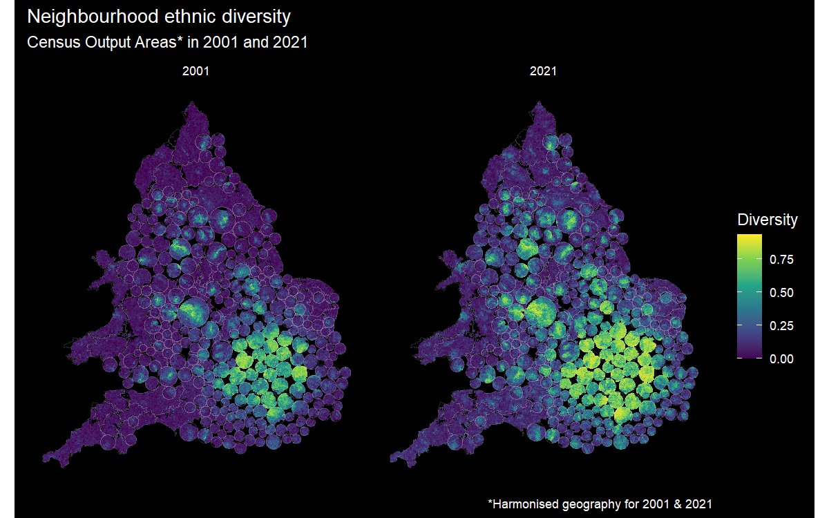{width=1000}## SummaryThis session has introduced the concept of geographically weighted statistics to examine spatial heterogeneity in a measured variable and to allow for the possibility that its strength (and direction) of correlation with another variable varies from place-to-place. As such, these statistics are a form of local statistic, which is to say they can vary across the map. Sometimes, the parts of the map that we are interested in are small in relation to other parts, creating a problem of invisibility/legibility. Maps inserts, balanced cartograms and hexograms have been introduced as a means to address this visualisation problem.## Futher readingGollini I, Lu B, Charlton M, Brunsdon C & Harris P (2015). GWmodel: An R Package for Exploring Spatial Heterogeneity Using Geographically Weighted Models. *Journal of Statistical Software*, 63(17), 1–50. [https://doi.org/10.18637/jss.v063.i17](https://doi.org/10.18637/jss.v063.i17){target="_blank"}{width=100}Brunsdon C, Comber A, Harris P, Rigby J & Large A (2021). In memoriam: Martin Charlton. *Geographical Analysis*, 54(4), 713–4. [https://doi.org/10.1111/gean.12309](https://doi.org/10.1111/gean.12309){target="_blank"}