Code
load("making_maps.RData")This continues directly from Part 1 of Thematic Maps in R. To begin, you may need to open your Project then load the workspace from Part 1. For example,
load("making_maps.RData")You may also need to reload all the previously used packages/libraries. I think this includes all the ones that you used last time and still need:
# Just a way of requiring more than one package at the same time:
pkgs <- c("tidyverse", "sf", "ggplot2", "RColorBrewer", "ggspatial", "ggsflabel")
invisible(lapply(pkgs, require, character.only = TRUE))And you need to know which packages have already been installed to avoid doing so again:
installed <- installed.packages()[,1]tmapClearly there is a lot of scope to produce high quality maps using ggplot2 and various associated packages. However, it has a rival, in tmap, which is arguably easier to use. Like ggplot2, tmap adopts the Grammar of Graphics but approaches it in a slightly different way that uses layers: it builds-up the layers of the graphic by first specifying a spatial object or background, then doing things to the map based on it, then specifying another spatial object and/or other map elements to do things with, and so forth. The types of layers available can be viewed here and here. A brief introduction to tmap is available here.
A good introduction to tmap is Spatial Data Visualization with tmap.
In version 3 of tmap, there was an error in the geometry of the municipal map file that it did not like. You can detect that error and determine where it is, using
all(st_is_valid(municipal))[1] FALSEwhich reveals there is a problem, and
which(!st_is_valid(municipal))[1] 128which shows it for the 128th area. The source of the problem is that,
st_is_valid(municipal[128,], reason = TRUE)[1] "Edge 25 crosses edge 27"Sometimes the function st_make_valid(...) is sufficient to fix the problem; or, a ‘quick fix’ – more of a side-step really – might be achieved by changing the coordinate reference system: below, it is changed from EPSG: 4326 (you can see this with st_crs(municipal)), to EPSG: 3857.
municipal2 <- st_transform(municipal, 3857)
all(st_is_valid(municipal2))[1] TRUEtmapFortunately, none of the above seems to really matter any more (well, not for the purpose of our mapping, at least) because version 4 of tmap is no longer throwing an error. The following code, for example, should work fine.
if(!("tmap" %in% installed)) install.packages("tmap", dependencies = TRUE)
require(tmap)
# The following sets tmap to its static map mode
tmap_mode("plot")
tm_graticules(col = "light grey") +
tm_shape(municipal, is.main = TRUE) +
tm_borders(col = "black")
Now we can produce a plot that is similar to one of the ggplots (in Part 1):
tm1 <- tm_graticules(col = "light grey") +
tm_shape(municipal) +
tm_polygons(
fill = "No_schooling",
fill.scale = tm_scale_intervals(
style = "jenks",
values = "-brewer.rd_yl_bu",
n = 7
),
fill.legend = tm_legend(
title = "%",
reverse = TRUE,
outside = TRUE,
outside.position = "right"
)
) +
tm_borders(col = "black")
print(tm1)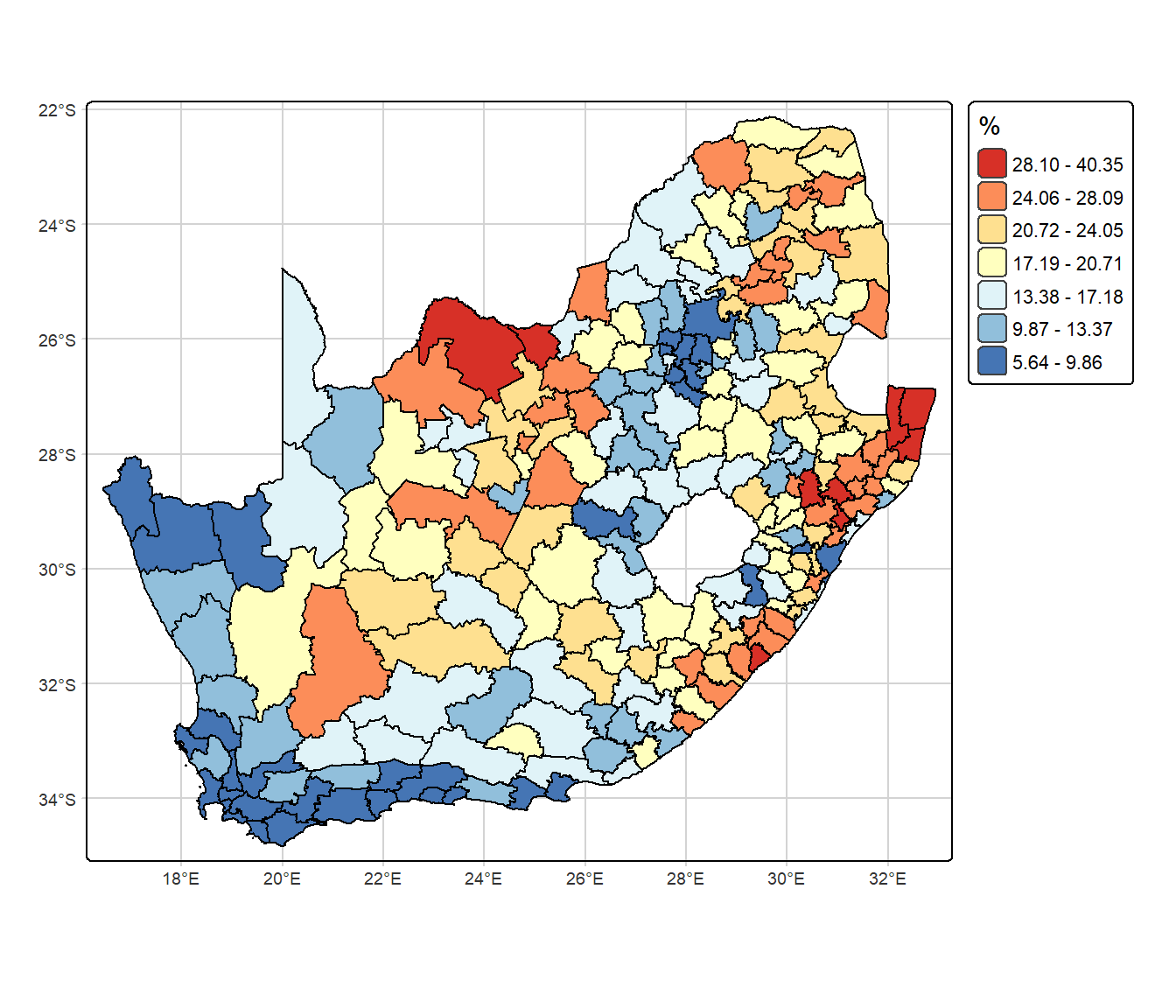
Adding the extra step of storing the map in the object tm1 before printing it was simply so we could more easily add layers to it:
tm2 <- tm1 +
tm_shape(cities) +
tm_dots(size = "population", shape = 3) +
tm_shape(cities |> filter(population > 1e6)) +
tm_text(
"name",
size = 1,
bgcol = "white",
bgcol_alpha = 0.6
) +
tm_compass(type = "arrow", position = c("right", "top")) +
tm_scalebar(position = c("left", "top"), bg.color = "white") +
tm_credits("Source: 2011 Census / Statistics South Africa",
bg.color = "white")
print(tm2)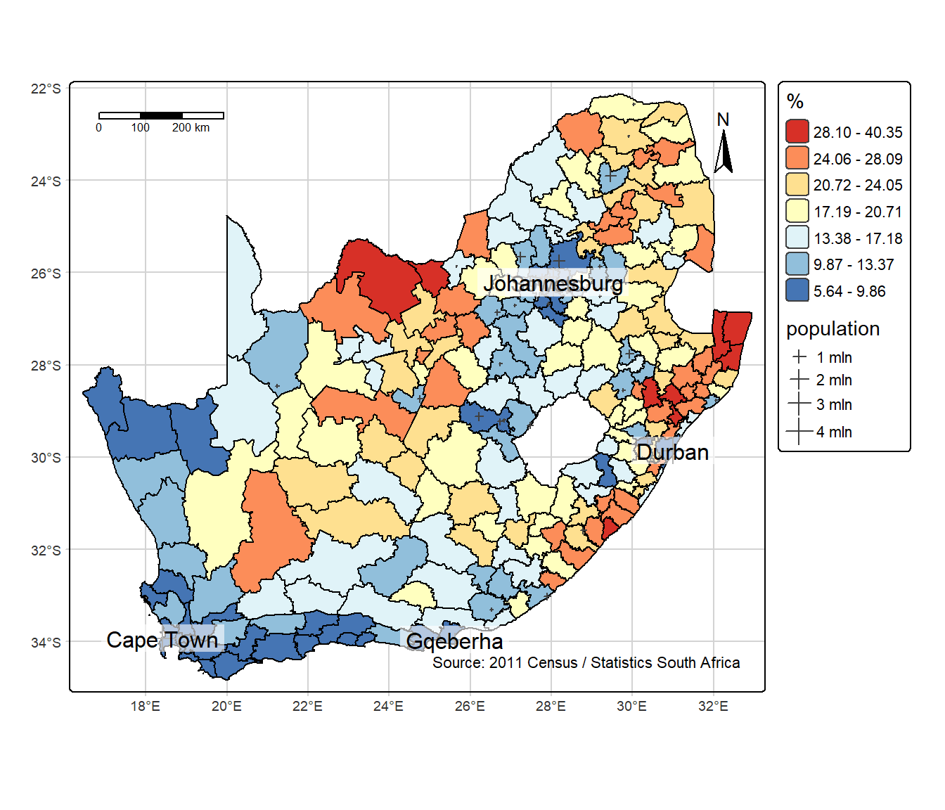
The map looks pretty good and can be saved using the function tmap_save. For example,
tmap_save(tm2, "no_schooling2.jpg", width = 7, units = "in")
Faceting can also be used on static maps, as in the following example, where tm_facets(by = "ProvinceName", free.coords = TRUE) creates a choropleth map for each Province, with a common legend.
tm_graticules(col = "light grey") +
tm_shape(municipal) +
tm_polygons(
fill = "No_schooling",
fill.scale = tm_scale_intervals(
style = "jenks",
values = "-brewer.rd_yl_bu",
n = 7
),
fill.legend = tm_legend(
title = "%",
reverse = TRUE,
)
) +
tm_facets(by = "ProvinceName",
ncol = 3,
free.coords = TRUE)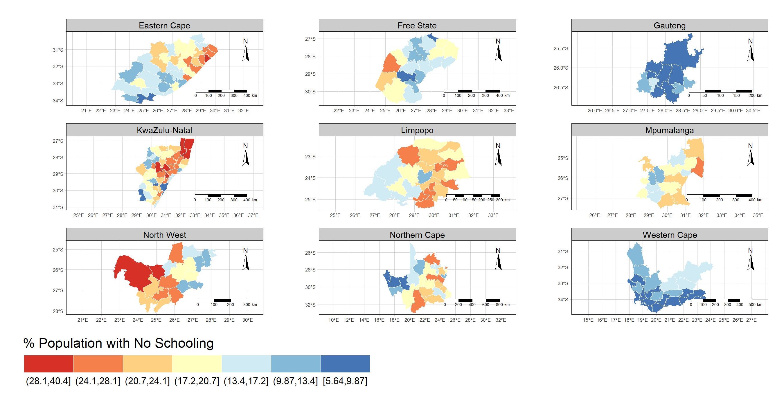
I am not convinced that any of the above is necessarily better or easier than using ggplot2. However, where tmap really excels is in rendering interactive maps to leaflet by changing the tmap_mode from tmap_mode("plot")to tmap_mode("view"). For example:
tmap_mode("view")
tm_basemap("OpenStreetMap.HOT") +
tm_shape(municipal) +
tm_polygons(
fill = "No_schooling",
fill.scale = tm_scale_intervals(
style = "jenks",
values = "-brewer.rd_yl_bu",
n = 7
),
fill.legend = tm_legend(
title = "%",
reverse = TRUE
)
) +
tm_borders(col = "black")– try clicking on one of the areas in the map and see what happens.
The map can, of course, be customised in many ways, including by extending the basemap options (move your mouse cursor over the map layers icon to change the basemap shown), specifying which variables ‘pop up’ when you click on the map, and so forth,
tm_basemap(c(OSM = "OpenStreetMap",
OSMHot = "OpenStreetMap.HOT",
Carto = "CartoDB")) +
tm_shape(municipal) +
tm_polygons(
fill = "No_schooling",
fill.scale = tm_scale_intervals(
style = "jenks",
values = "brewer.bu_pu",
n = 7
),
fill.legend = tm_legend(
title = "%",
reverse = TRUE
),
id = "LocalMunicipalityName.x",
popup.vars = c("% No schooling:" = "No_schooling",
"Province: " = "ProvinceName"),
popup.format = list(digits = 1)
) +
tm_borders(col = "black")

Different layers are available dependent upon the tmap_mode. For example, there is no straightforward way of adding a maptile (tm_basemap) as the backdrop to a map in tmap’s "plot" mode, or a compass (tm_compass) or a scale bar (tm_scale_bar) in "view" mode.
ggplot2Sometimes we want to the colours on the map to reflect the combination of two variables’ values, not just one. We can use the biscale package to do this, in conjunction with ggplot2.
We begin by loading the package and, in the code chunk below, I also create a new variable that I would like to map (it is a modification of one that already exists in the data).
if(!("biscale" %in% installed)) install.packages("biscale", dependencies = TRUE)
require(biscale)
# Here I am creating a new variable that I am going to use on the final map:
# It is the percentage of people with some schooling
municipal <- municipal |>
mutate(Schooling = 100 - No_schooling)The two variables that I am going to map are Schooling (percentage of the population with some schooling) and Higher (percentage with higher education). To do this, both variables will be split into three (dim = 3) classes, from lower to higher values, thereby creating what is, in effect, a 3 by 3 matrix of possible categories that each municipal can belong to. In the below, I have used a Jenks classification to create the classes (style = "jenks") but there are other options (see ?bi_class).
df <- bi_class(municipal, x = Schooling, y = Higher, style = "jenks", dim = 3)This has created a new sf object called df in the example above. This object has a variable in it called bi_class, which associates each municipality with one of the 3 by 3 categories:
df$bi_class [1] "3-3" "3-2" "2-2" "2-1" "3-3" "2-2" "2-1" "3-1" "3-2" "3-1" "1-1" "2-1"
[13] "1-1" "2-1" "2-1" "3-2" "3-1" "2-2" "2-1" "2-1" "3-2" "2-1" "1-1" "1-1"
[25] "2-1" "2-1" "2-1" "2-2" "2-2" "1-1" "1-1" "1-1" "2-1" "2-2" "2-1" "2-1"
[37] "1-1" "1-1" "3-3" "2-1" "2-1" "2-1" "3-1" "2-1" "1-1" "2-1" "3-2" "3-1"
[49] "2-1" "3-2" "2-1" "2-2" "2-1" "3-2" "3-2" "3-2" "3-3" "2-1" "3-3" "3-3"
[61] "3-3" "3-3" "3-2" "3-3" "3-3" "3-1" "3-2" "3-3" "3-3" "3-3" "1-1" "3-2"
[73] "2-1" "2-1" "2-1" "3-2" "2-1" "3-3" "2-2" "2-1" "3-3" "2-1" "2-1" "3-2"
[85] "1-1" "2-2" "1-1" "2-1" "3-2" "1-1" "1-1" "1-1" "3-2" "2-1" "2-1" "2-1"
[97] "1-1" "2-1" "1-1" "1-1" "1-1" "1-1" "1-1" "1-1" "1-1" "2-1" "3-3" "1-1"
[109] "1-1" "1-1" "1-1" "3-1" "2-2" "1-1" "1-1" "2-1" "2-2" "3-2" "2-1" "3-1"
[121] "1-1" "1-1" "1-2" "2-2" "1-1" "2-2" "2-1" "2-2" "2-2" "1-1" "2-1" "1-1"
[133] "3-3" "2-2" "2-2" "2-2" "2-2" "2-2" "3-2" "2-2" "1-1" "1-1" "1-1" "1-1"
[145] "1-1" "1-1" "2-2" "2-1" "1-1" "2-2" "2-1" "3-2" "2-2" "3-3" "3-3" "2-2"
[157] "2-1" "2-1" "2-2" "2-2" "2-2" "1-1" "1-1" "2-1" "3-2" "3-2" "2-1" "2-1"
[169] "1-1" "1-1" "2-2" "2-2" "1-1" "1-2" "1-1" "1-1" "1-1" "1-1" "2-1" "3-3"
[181] "3-2" "1-1" "3-2" "3-2" "3-1" "2-2" "1-2" "3-1" "1-2" "2-1" "2-2" "1-2"
[193] "2-2" "2-2" "2-1" "1-1" "2-1" "3-1" "3-2" "2-1" "2-1" "2-2" "3-2" "2-1"
[205] "2-1" "1-2" "1-1" "2-2" "2-3" "3-3" "3-2" "3-2" "3-2" "3-2" "3-2" "3-2"
[217] "3-3" "3-3" "3-2" "3-2" "3-2" "3-3" "3-3" "3-2" "3-1" "3-3" "3-3" "3-3"
[229] "3-2" "3-3" "3-3" "2-2" "2-2" "3-2"Now we can map it,
bi_map <- ggplot() +
geom_sf(data = df, mapping = aes(fill = bi_class), color = "white", size = 0.1, show.legend = FALSE) +
bi_scale_fill(pal = "BlueYl", dim = 3) +
labs(title = "Bivariate map of education propensity in South Africa (2011)") +
bi_theme() +
theme(plot.title = element_text(size = 10))
print(bi_map)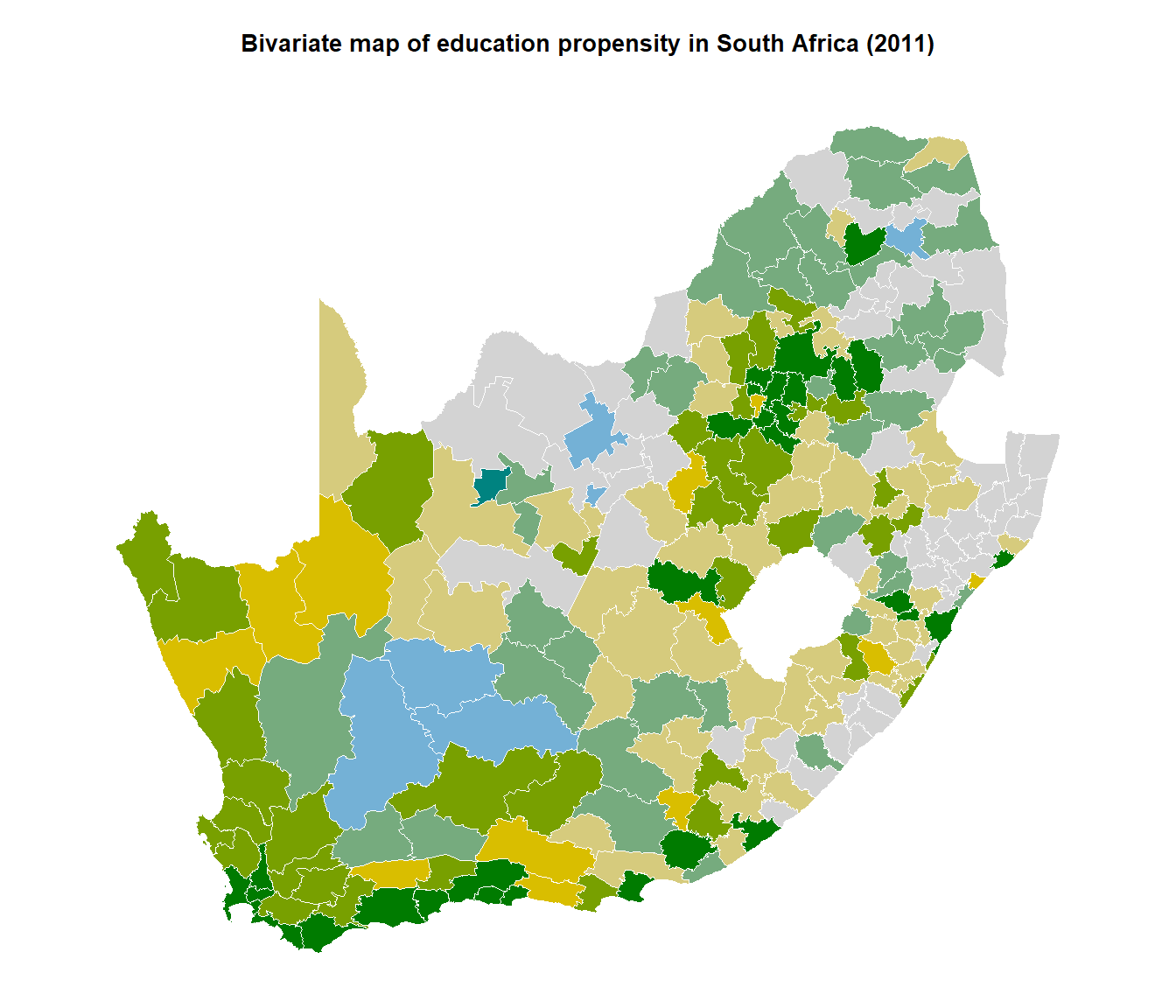
It looks colourful (other colour palettes are detailed at ?bi_pal) but it lacks a legend. We will need the package cowplot to add it to the current plot.
First, create the legend:
legend <- bi_legend(pal = "BlueYl",
dim = 3,
xlab = "Higher % Schooling ",
ylab = "Higher % HE",
size = 7)Second, add it to the plot:
if(!("cowplot" %in% installed)) install.packages("cowplot", dependencies = TRUE)
require(cowplot)
finalPlot <- ggdraw() +
# Use ?draw_plot to help understand the following arguments
draw_plot(bi_map, -0.1, 0, 1, 1) +
draw_plot(legend, 0.7, 0.1, 0.4, 0.4)
print(finalPlot)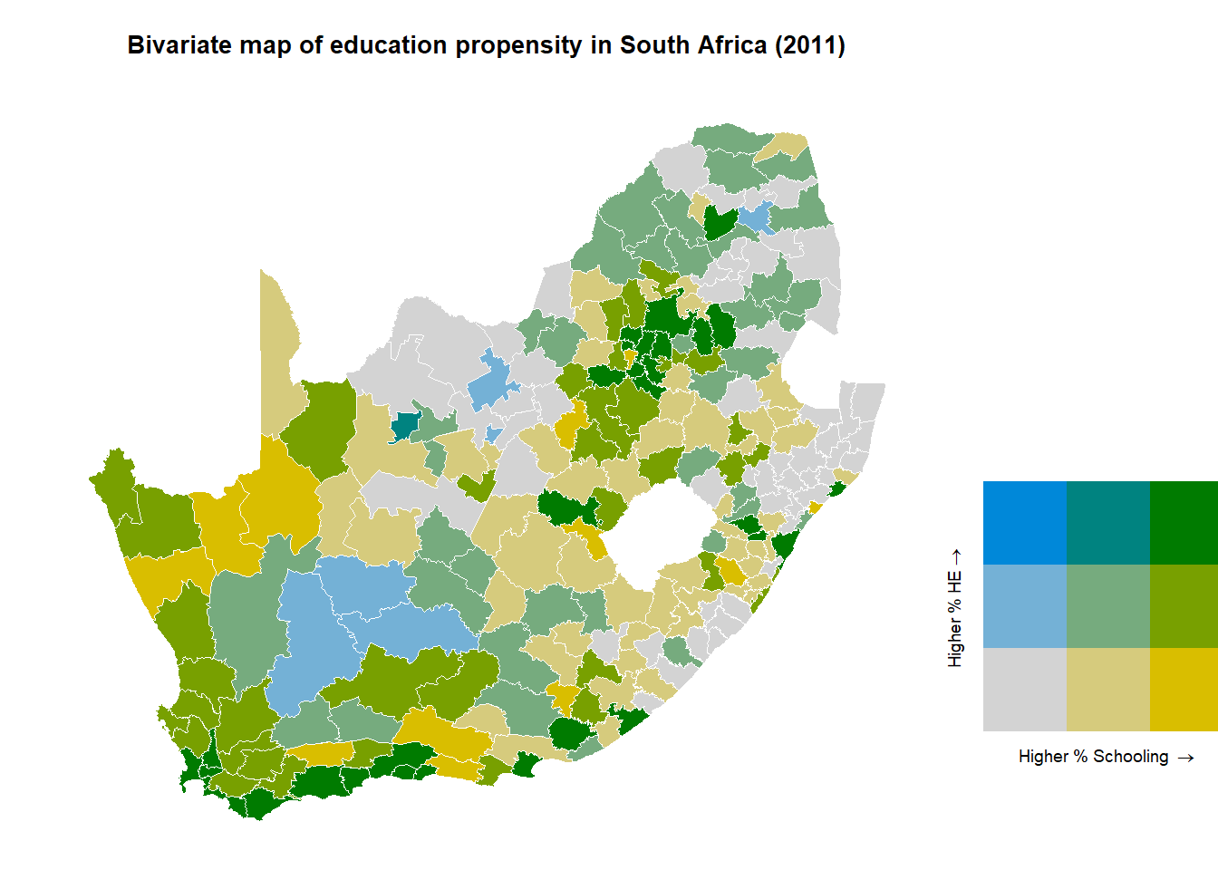
It could be tidied up a little, but this is not too bad.
A cartogram – of which there are lots of interesting examples on this website – usually works by distorting a map in a way that rescales the areas in proportion not to their physical size but by some other measured attribute such as their population count. Much of the motivation for this lies in political studies and mapping the results of an election wherein a traditional map can give a very distorted view of the outcome because of how much population density varies across a country. In the example below, rescaling the areas by population correctly shows that the 2020 US Presidential was not a Republican landslide, despite Trump’s baseless accusations!
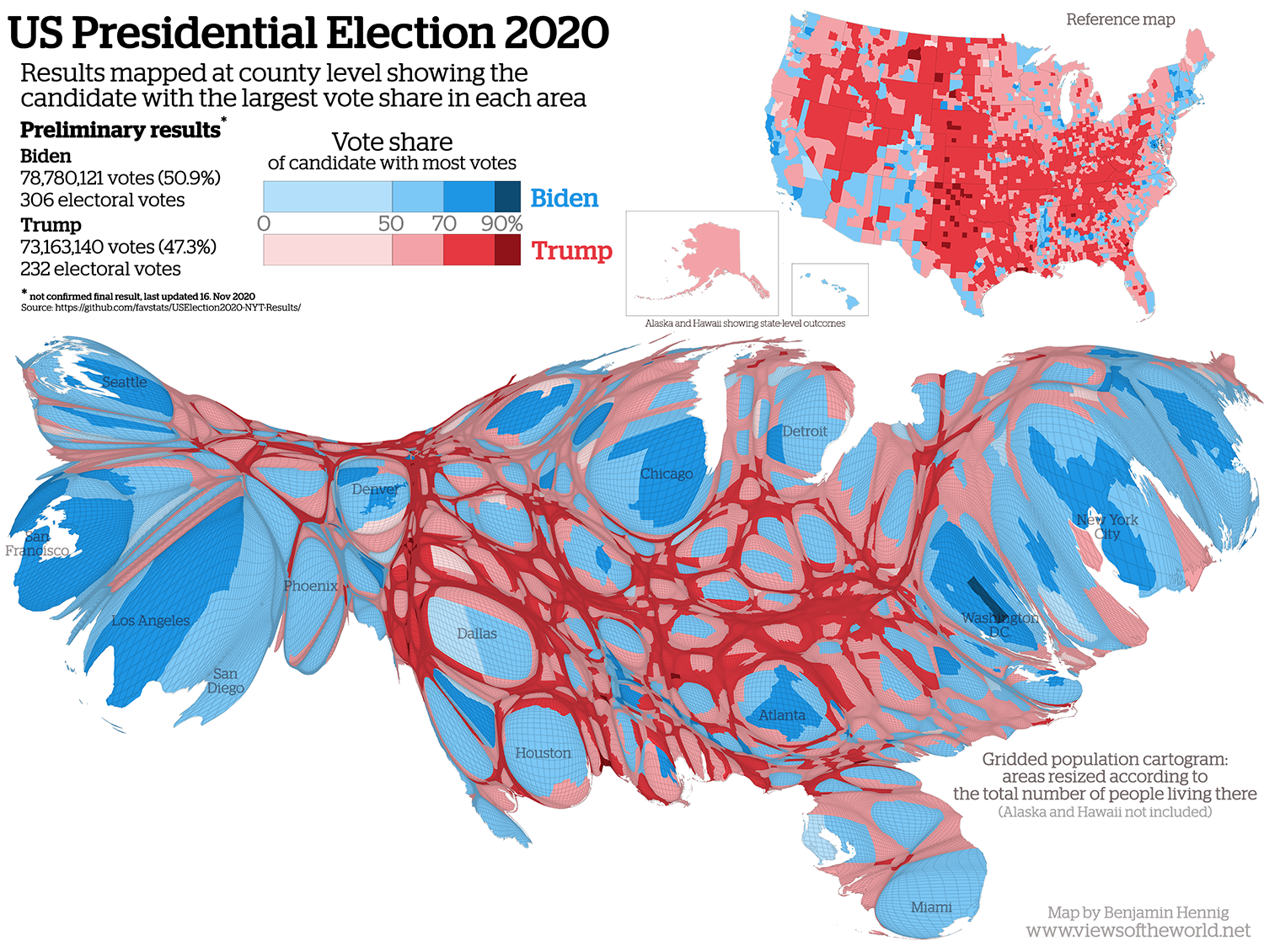 Source: www.viewsoftheworld.net
What you are looking at, above, is a contiguous cartogram that preserves topology. The map is distorted but areas that share a boundary (which are adjacent) still do so after the distortion. Let’s create a contiguous cartogram of the South African municipalities, scaling the areas by an approximate population figure (created by ChatGTP, so for demonstrative purposes only).
if(!("cartogram" %in% installed)) install.packages("cartogram", dependencies = TRUE)
require(cartogram)
# Read in the estimated population counts
population <- read_csv("https://raw.githubusercontent.com/profrichharris/profrichharris.github.io/refs/heads/main/MandM/data/Municipalities_with_Population__approx_2011_.csv")
# Join them to the municipality data
# and transform the data on to a projected CRS
# and create the cartogram
df <- municipal |>
left_join(population, by = c("LocalMunicipalityName.x", "LocalMunicipalityCode")) |>
st_transform(22234)
carto <- df |>
cartogram_cont(weight = "Population2011", verbose = TRUE)Next we can plot it, now having the size of the areas in proportion to their indicative populations, and their fill colour indicating levels of no schooling.
g1 <- ggplot(carto, aes(fill = No_schooling)) +
geom_sf() +
scale_fill_viridis_c("%") +
labs(title = "Contiguous cartogram") +
coord_sf() +
theme_map() +
theme(plot.title = element_text(hjust = 0.5))
plot(g1)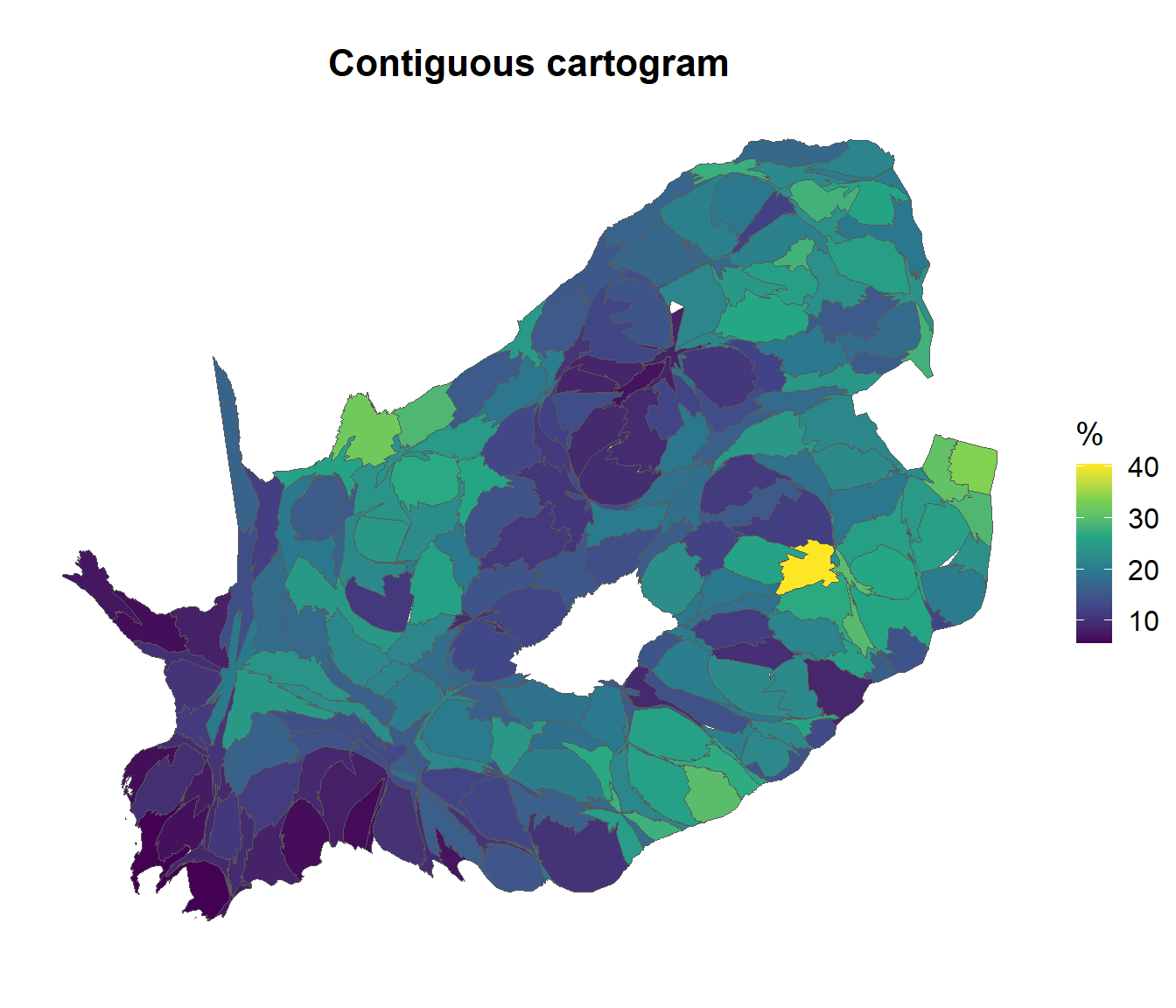
And we can, if we wish, use cowplot to plot it alongside the original map, for comparison.
g2 <- ggplot(municipal |> st_transform(22234), aes(fill = No_schooling)) +
geom_sf() +
scale_fill_viridis_c("%") +
labs(title = "Original map") +
theme_map() +
theme(plot.title = element_text(hjust = 0.5))
gg <- list(g1, g2)
legend <- get_legend(gg[[1]])
lapply(gg, \(x) {
x + theme(legend.position='none')
}) -> gg
ggdraw(plot_grid(plot_grid(plotlist = gg, ncol = 2, align = "v"),
plot_grid(NULL, legend, scale = 0.5),
rel_widths=c(1, 0.25)))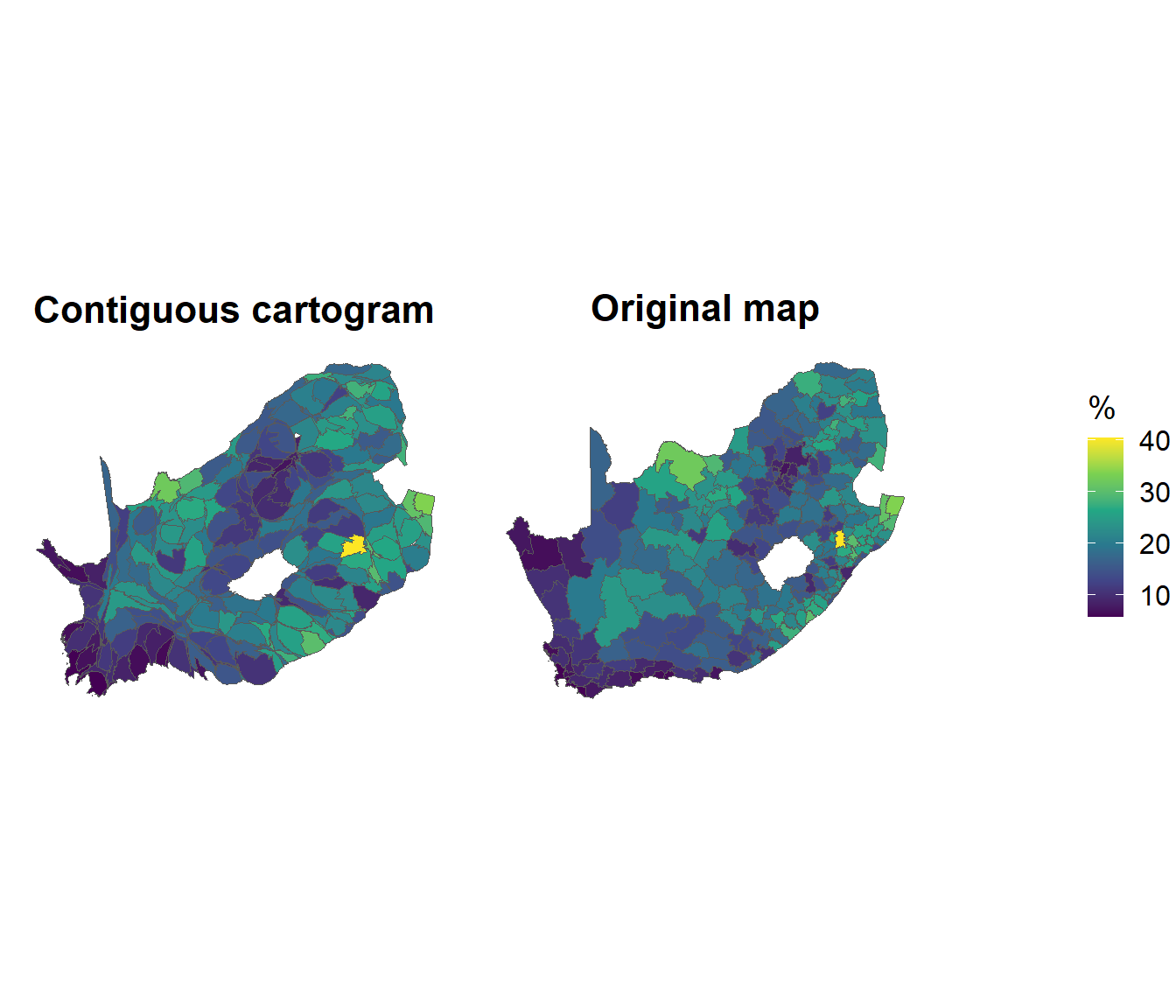
The geographer and social commentator, Professor Danny Dorling helped to raise the profile of cartograms with books such as his A New Social Atlas of Britain, which visualised the social geography of England, Scotland and Wales, using 1991 Census data, in a way that was very novel when it was published in 1995. He also wrote a guide to and history of the technique, which is available here. Danny has always appreciated the importance of geographical visualisation to reveal and to shed light on spatial inequalities within society.
The method Danny used does not preserve topology (neighbouring places may be forced apart) but the results are arguably more aesthetically pleasing than those of the above. Here is the same data as before, but this time as a Dorling cartogram:
carto <- df |>
cartogram_dorling(weight = "Population2011")
g3 <- ggplot(carto, aes(fill = No_schooling)) +
geom_sf() +
scale_fill_viridis_c("%") +
labs(title = "Dorling cartogram (attempt 1)") +
coord_sf() +
theme_map() +
theme(plot.title = element_text(hjust = 0.5))
plot(g3)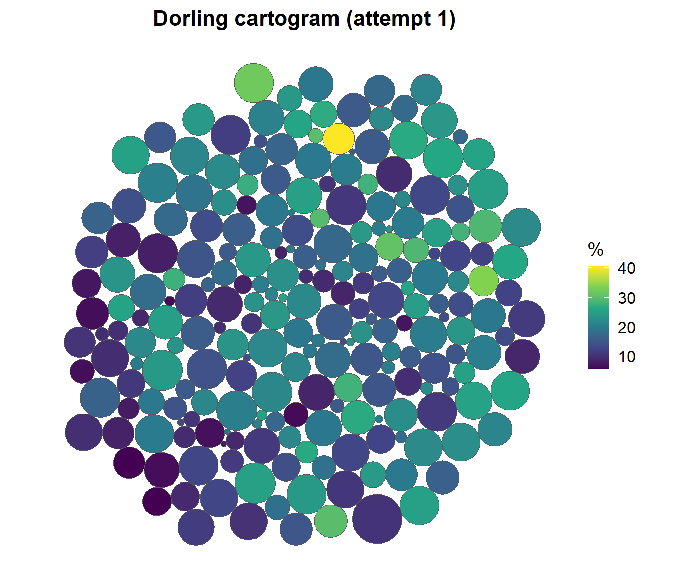
The attempt, above, has not been very successful but there are things we can do to improve it, such as anchoring the places with the largest populations more closely to their original positions on the map and allowing the various circles (areas) within the cartogram to form less of a ‘big circle’ overall.
anchor <- 1 - (df$Population2011 - min(df$Population2011)) /
(max(df$Population2011) - min(df$Population2011))
carto <- df |>
cartogram_dorling(weight = "Population2011", m_weight = anchor, k = 1)
g4 <- ggplot(carto, aes(fill = No_schooling)) +
geom_sf() +
scale_fill_viridis_c("%") +
labs(title = "Dorling cartogram (attempt 2)") +
coord_sf() +
theme_map() +
theme(plot.title = element_text(hjust = 0.5))
plot(g4)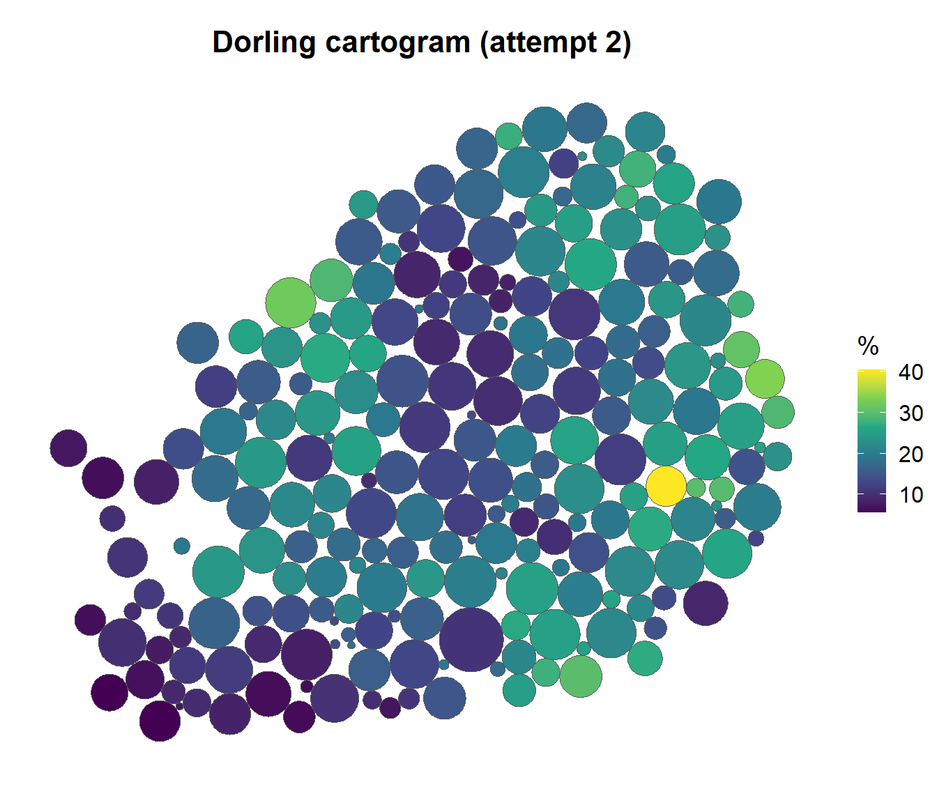
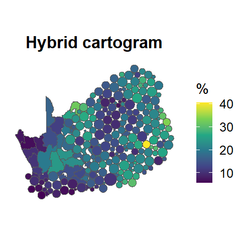
I sometimes combine this approach with the original map to create what I call hybrid cartograms, of which there is an example below.
To this point of the session we have been using maps to represent the spatial distribution of one or more variables whose values are plotted as an aesthetic of the map such as colour or shape size. A different approach is offered by the geofacet package which uses geography as a ‘placeholder’ to position graphical summaries of data for different parts of the map. The idea is to flexibly visualise data for different geographical regions by providing a ggplot2 faceting function facet_geo() that works just like ggplot2’s built-in faceting, except that the resulting arrangement of panels follows a grid that mimics the original geographic topology as closely as possible.
Here is an example of it in use, showing the distribution of municipalities within South African provinces in terms of the percentage of the population with higher education (university) qualifications.
if(!("geofacet" %in% installed)) install.packages("geofacet")
require(geofacet)
# Define a grid that mimics the geographical distribution of the provinces
mygrid <- data.frame(
code = c("LIM", "GT", "NW", "MP", "NC", "FS", "KZN", "EC", "WC"),
name = c("Limpopo", "Gauteng", "North West", "Mpumalanga", "Northern Cape",
"Free State", "KwaZulu-Natal", "Eastern Cape", "Western Cape"),
row = c(1, 2, 2, 2, 3, 3, 3, 4, 4),
col = c(3, 3, 2, 4, 1, 2, 3, 2, 1),
stringsAsFactors = FALSE
)
# Plot the data with the geofaceting
ggplot(municipal, aes(Higher)) +
geom_boxplot(col = "dark grey") +
geom_density() +
geom_rug() +
facet_geo(~ ProvinceName, grid = mygrid) +
scale_y_continuous(breaks = c(0, 0.2, 0.4)) +
theme_bw() +
labs(
title = "Percentage of Population with higher education",
caption = "Source: 2011 Census / Statistics South Africa"
) +
xlab("% per municipality")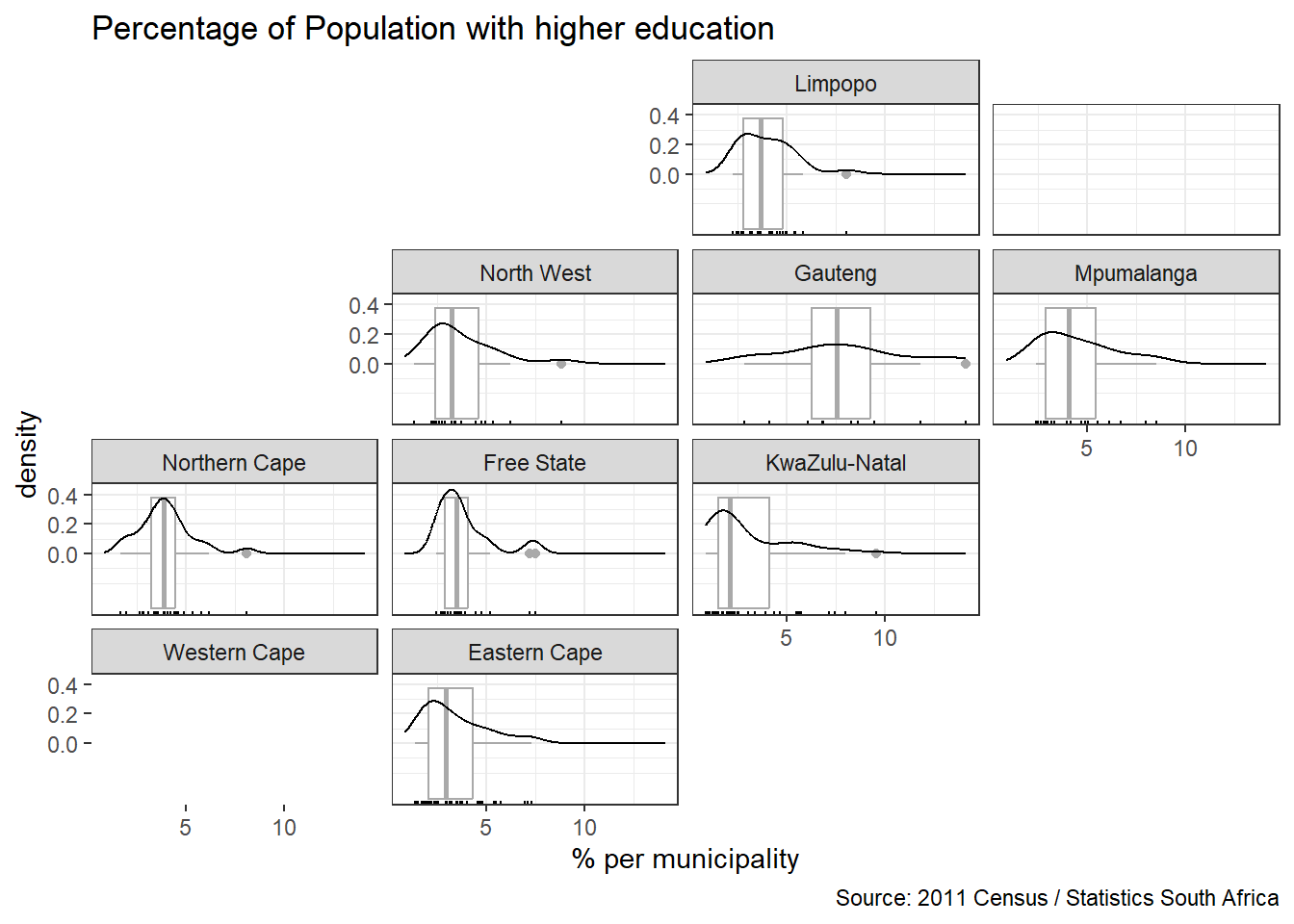
Finally, we will take a brief glimpse at Shiny, which is described as “an open source R package that provides an elegant and powerful web framework for building web applications using R” [or Python]. At the time of writing, there is a nice example of a mapping application on the Shiny homepage.
Teaching Shiny in detail is beyond the scope of this course but there are Getting Started guides (for both R and Python) and a gallery of applications which can be viewed here.
The following code gives you a feel for Shiny. It creates an app that allows variables from the South African municipality data to be selected and mapped, with various choices for the maps classes and colour palette. Don’t worry if not all of the code makes sense to you but hopefully you will recognise some parts from this session and will see that the basis of the app is to define a user interface and then to define tasks on the server side that will take some inputs from selections made by the user in the interface.
# This checks that the required packages are installed and then loaded
installed <- installed.packages()[,1]
pkgs <- c("shiny", "sf", "tidyverse", "ggplot2", "sf", "classInt", "RColorBrewer",
"ggspatial")
install <- pkgs[!(pkgs %in% installed)]
if(length(install)) install.packages(install, dependencies = TRUE)
invisible(lapply(pkgs, require, character.only = TRUE))
# This downloads the map and the data and merges them
map <- read_sf("https://github.com/profrichharris/profrichharris.github.io/raw/main/MandM/boundary%20files/MDB_Local_Municipal_Boundary_2011.geojson")
mapping_data <- read_csv("https://github.com/profrichharris/profrichharris.github.io/raw/main/MandM/data/education.csv")
map <- left_join(map, mapping_data, by = "LocalMunicipalityCode")
# This selects out from the data the variables of interest
df <- map |>
st_drop_geometry() |>
select(where(is.double), -starts_with("Shape"))
# This defines the user interface
ui <- fluidPage(
# Application title
titlePanel("Educational geographies for South African municipalities"),
# Sidebar with various types of input
sidebarLayout(
sidebarPanel(
varSelectInput("var", "Mapping variable", df),
sliderInput("brks", "Classes", min = 3, max = 8, value = 5, step = 1),
selectInput("type", "Classification", c("equal", "quantile", "jenks")),
selectInput("pal", "Palette", rownames(brewer.pal.info)),
checkboxInput("rev", "Reverse palette"),
checkboxInput("north", "North arrow")
),
# The main panel with contain the map plot
mainPanel(
plotOutput("map")
)
)
)
# This defines the server side of the app, taking various inputs
# from the user interface
server <- function(input, output, session) {
output$map <- renderPlot({
vals <- map |>
pull(!!input$var)
brks <- classIntervals(vals, n = input$brks, style = input$type)$brks
map$gp <- cut(vals, brks, include.lowest = TRUE)
p <- ggplot(map, aes(fill = gp)) +
geom_sf() +
scale_fill_brewer("%", palette = input$pal, direction = ifelse(input$rev, 1, -1)) +
theme_minimal() +
guides(fill = guide_legend(reverse = TRUE)) +
labs(caption = "Source: 2011 Census, Statistics South Africa")
if(input$north) p <- p + annotation_north_arrow(location = "tl",
style = north_arrow_minimal(text_size = 14))
p
}, res = 100)}
# This loads and runs the app
shinyApp(ui, server)You can play with this app to see how changing the design of the map can easily affect your interpretation of the geography of what it shows. The classic book about this is Mark Monmonier’s How to Lie with Maps.
That’s almost it for now! However, before finishing, we will save the map with the joined attribute data to the working directory as an R object.
save(municipal, file = "municipal.RData")The two parts of this session have demonstrated that R is a powerful tool for drawing publication quality maps. The native plot functions for sf objects are useful as a quick way to draw a map, and both ggplot2 and tmap offer a range of functionality to customise their cartographic outputs to produce really nice looking maps. I tend to use ggplot2 but that is really more out of habit than anything else because tmap is very accomplished too. It depends a bit on whether I am drawing static maps (usually in ggplot2) or interactive ones (probably better in tmap). There are other packages available, too, including mapview, which the following code chunk uses (see also, here), and Leaflet to R.
if(!("mapview" %in% installed)) install.packages("mapview", dependencies = TRUE)
require(mapview)
mapview(municipal %>% mutate(No_schooling = round(No_schooling, 1)),
zcol = "No_schooling",
layer.name = "% No Schooling",
map.types = "OpenStreetMap.HOT",
col.regions = colorRampPalette(rev(brewer.pal(9, "RdYlBu"))))
Perhaps the key take-home point is that these maps can look at lot better than those produced by some conventional GIS, can be fairly easily scripted (with a bit of practice) and have the advantage that they can be linked to other analytically processes in R, as future sessions will demonstrate.
Chapter 2 on Spatial data and R packages for mapping from Geospatial Health Data by Paula Morga.
Chapter 9 on Making maps with R from Geocomputation with R by Robin Lovelace, Jakub Nawosad & Jannes Muenchow.
Chapter 8 on Plotting spatial data from Spatial Data Science with Applications in R by Edzer Pebesma and Roger Bivand.
See also: Elegant and informative maps with tmap, which is a work in progress by Martijn Tennekes and Jakub Nowosad.